R provides several powerful tools for financial market analysis. This tutorial will go through how to download and plot the daily stock prices from Yahoo! Finance using quantmod. Yahoo finance provides free access to historic stock prices at the time of writing this article.
Table of contents
Install quantmod package
There are several ways to download financial data using R. In this tutorial we will use the quantmod package, which is the most commonly used package. We can install quantmod as follows from the R console:
install.packages("quantmod")
The prices we download using quantmod are stored as xts and zoo objects.
Install broom
We also need to install broom to allow us to manipulate the stock prices in preparation for ggplot2.
install.packages("broom")
How to Find Stock Prices
You can find stock prices by going to investment websites like NYSE or Google Finance and entering the company name in the website’s search engine. The search will return the ticker symbol along with other financial information about the company.
Get Stock Prices from Yahoo Finance
First, we will need to load the relevant packages for the analysis.
library(quantmod)
library(ggplot2)
library(magrittr)
library(broom)
Next, we will download the Nvidia stock prices using quantmod from 23rd February 2020 to 23 February 2021.
options("getSymbols.warning4.0"=FALSE)
options("getSymbols.yahoo.warning"=FALSE)
We need to pass the ticker symbol for Nvidia, which is NVDA, as well as the source, which is Yahoo and the time ranges.
We can define the start and end date using as.Date and pass the variables to the from and to arguments.
The quantmod package downloads and stores symbols with their names, which we can turn off by passing the argument auto.assign = FALSE to the getSymbols function.
start = as.Date("2020-02-23")
end = as.Date("2021-02-23")

getSymbols("NVDA", from = start, to = end, src="yahoo", warnings=FALSE, auto.assign=TRUE)
[1] "NVDA"
We can look at the first rows using the head function as follows:
head(NVDA)
       NVDA.Open NVDA.High NVDA.Low NVDA.Close NVDA.Volume NVDA.Adjusted
2020-02-24   67.5475   70.4675  67.0000    68.3200    85691600      68.13633
2020-02-25   69.0750   69.6975  64.4900    65.5125   105549600      65.33637
2020-02-26   65.5150   68.8625  65.5000    66.9125    74773200      66.73260
2020-02-27   63.7250   66.7500  62.2225    63.1500    90641600      63.01790
2020-02-28   60.6150   68.1150  60.4475    67.5175   113325200      67.37625
2020-03-02   69.2250   69.3975  65.2500    69.1075    89074400      68.96292
We can verify the class of the NVDA object using the class function as possible:
class(NVDA)
[1] "xts" "zoo"
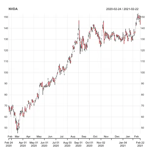
Chart Series of Stock Price in R
Now that we have the data, we can plot the NVDA object using the chart_Series function. The function returns a candlestick chart, which we can use to determine possible price movement based on past patterns.
chart_Series(NVDA)
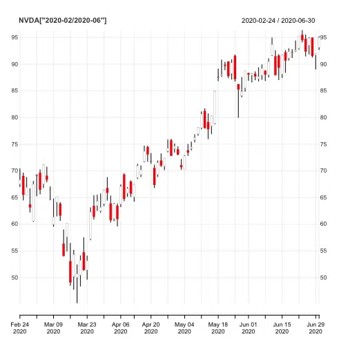
We can zoom into a particular period of the series by putting the dates in square brackets. For example, let’s zoom in between February and June 2020 and:
chart_Series(NVDA['2020-02/2021-06'])
Plot Multiple Stocks using quantmod
We can use the getSymbols function to retrieve multiple stock prices. We need to store the tickers symbols in a character vector. We will choose three other technology stocks. The tickers we need are “AAPL” (Apple), “NVDA” (Nvidia), “MSFT” (Microsoft), and “GOOGL” (Google).
We will keep the date ranges and the source the same.
start = as.Date("2020-02-23")
end = as.Date("2021-02-23")

getSymbols(c("AAPL", "NVDA", "MSFT", "GOOGL"), src="yahoo", from = start, to = end, warnings=FALSE, auto.assign=TRUE)
Organize Stocks as Data Frame
We can store the stock prices as a data frame using as.xts and set the column names and indexes of the data frame using names() and index().
stocks = as.xts(data.frame(A = AAPL[, "AAPL.Adjusted"], B = NVDA[, "NVDA.Adjusted"], C=MSFT[, "MSFT.Adjusted"], D=GOOGL[, "GOOGL.Adjusted"]))
names(stocks) = c("Apple", "Nvidia", "Microsoft", "Google")
index(stocks) = as.Date(index(stocks))
head(stocks)
Let’s get the first rows of the data frame using the head() function.
head(stocks)
             Apple   Nvidia Microsoft  Google
2020-02-24 73.42667 68.13631  167.4141 1419.86
2020-02-25 70.93955 65.33636  164.6514 1386.32
2020-02-26 72.06491 66.73261  166.7088 1390.47
2020-02-27 67.35416 63.01790  154.9626 1314.95
2020-02-28 67.31476 67.37625  158.7148 1339.25
2020-03-02 73.58181 68.96292  169.2755 1386.32
Let’s attempt to plot the four stock price movements on a single chart using ggplot2.
stocks_plot = tidy(stocks) %>%

     ggplot(aes(x=index,y=value, color=series)) +
     labs(title = "Four US Tech Company Daily Stock Prices February 2020 - February 2021 (1)",

          subtitle = "End of Day Adjusted Prices",
          caption = " Source: Yahoo Finance") +

     xlab("Date") + ylab("Price") +
     scale_color_manual(values = c("Red", "Green", "DarkBlue","Magenta"))+
     geom_line()
stocks_plot
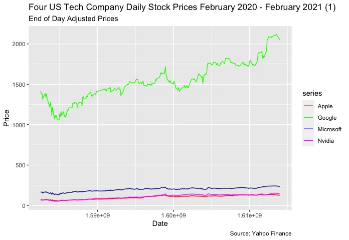
We can see the the stock price for Google dwarfs the other three stocks, making them difficult to interpret. We can solve this by plotting the stocks on individual sub-charts using a facet grid.
Plot Multiple Stocks as a Facet Grid using quantmod
We can plot the four stock prices using facet_grid(), which forms a matrix of panels defined by row and column faceting variables.
stocks_plot2 = tidy(stocks) %>%

     ggplot(aes(x=index,y=value, color=series)) +
     geom_line() +
     facet_grid(series~.,scales="free") +
     labs(title = "Four US Tech Company Daily Stock Prices February 2020 - February 2021 (1)",

          subtitle = "End of Day Adjusted Prices",
          caption = " Source: Yahoo Finance") +

     xlab("Date") + ylab("Price") +
     scale_color_manual(values = c("Red", "Green", "DarkBlue","Magenta"))+
     geom_line()
stocks_plot2
Let’s run the code to see the result.
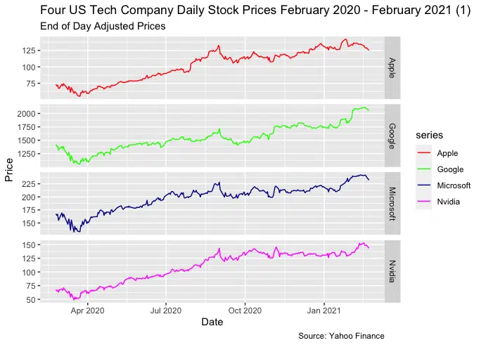
We successfully showed the stock prices for the four companies on separate panels.
Summary
Congratulations on reading to the end of the tutorial!
For finance-related tools, go to our free Black-Scholes Options Pricing Calculator.
Go to the online courses page on R to learn more about coding in R for data science and machine learning.
Have fun and happy researching!

Suf is a senior advisor in data science with deep expertise in Natural Language Processing, Complex Networks, and Anomaly Detection. Formerly a postdoctoral research fellow, he applied advanced physics techniques to tackle real-world, data-heavy industry challenges. Before that, he was a particle physicist at the ATLAS Experiment of the Large Hadron Collider. Now, he’s focused on bringing more fun and curiosity to the world of science and research online.