You can rotate the axis labels by using angle parameter of the element_text() function when modifying the theme of your plot, for example:
theme(axis.text.x = element_text(angle = 90, vjust = 0.5)
We can use vjust and hjust in element_text() to add horizontal and vertical space to the axis labels.
This tutorial will go through how to rotate and space axis labels using ggplot2 in R with code examples.
Table of contents
Example
Let’s look at an example of creating a bar chart using the gapminder dataset. First we will install and load ggplot2 and dplyr.
install.packages("ggplot2")
install.packages("dplyr")
library(ggplot2)
library(dplyr)
library(gapminder)
Next, we will use the pipe operator to get the mean life expectancy of ten randomly sampled countries.
df <- gapminder %>%
group_by(country) %>%
summarize(mean_life = mean(lifeExp)) %>%
sample_n(10) %>%
mutate(country=fct_reorder(country, mean_life))
We can plot the resultant data frame as a bar chart as follows:
ggplot(df, aes(x=country, y=mean_life)) +
 geom_bar(stat="identity")
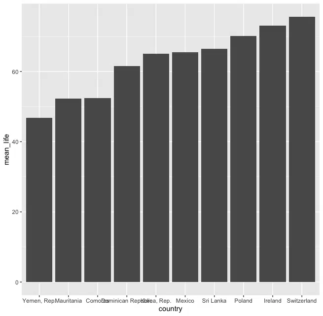
However, we can see that some of the x-axis tick labels are overlapping making them hard to read.
Solution: element_text
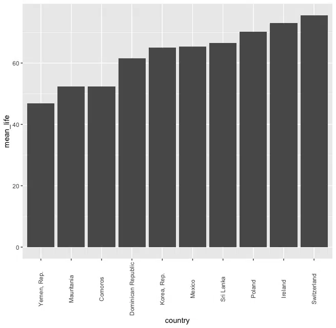
We can rotate the x-axis tick labels to make them easier to read. We can pass the angle to rotate the text by to the angle parameter in the element_text() function. We can also adjust the spacing using hjust and vjust, where hjust determines the horizontal justification and vjust determines the vertical justification.
Let’s look at the revised code:
df <- gapminder %>%
group_by(country) %>%
summarize(mean_life = mean(lifeExp)) %>%
sample_n(10) %>%
mutate(country=fct_reorder(country, mean_life))
ggplot(df, aes(x=country, y=mean_life)) +

geom_bar(stat="identity") +

theme(axis.text.x = element_text(angle = 90, vjust = 0.5)
We also added vjust = 0.5 so that the x-axis tick label aligns with the tick.
Solution: Coord Flip
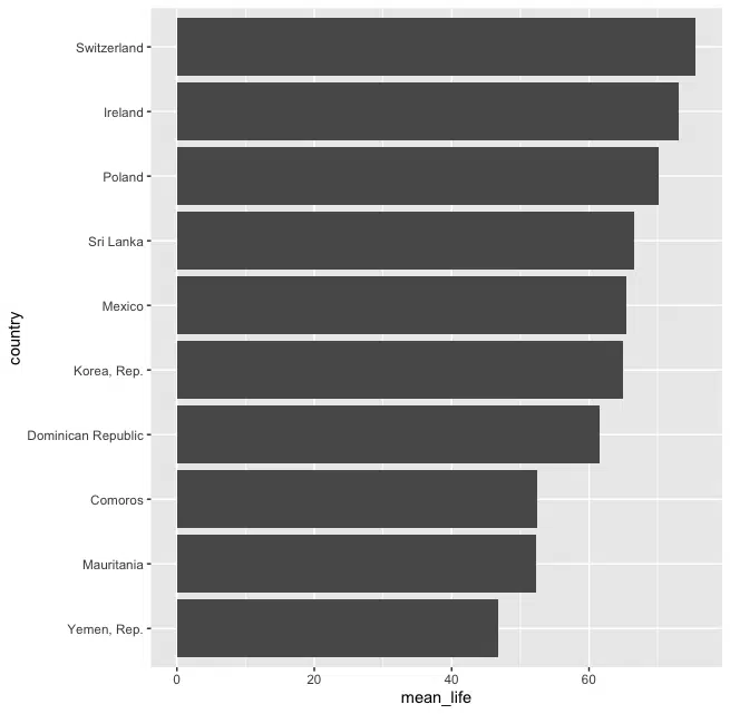
We can also use the coord_flip() function to flip the axes. We need to put the coord_flip() after the geom_bar() constructor as follows:
ggplot(df, aes(x=country, y=mean_life)) +

geom_bar(stat="identity") +

coord_flip()
Solution: str_wrap
If we want to keep the x-axis tick labels horizontal but stop the text from overlapping we can use str_wrap(), which wraps text to a specific number of characters per line. The function is typically used to create paragraphs. We can create a new column in the data frame with the text wrapped to 8 characters per line.
library(stringr)

df$country2 <- str_wrap(df$country, width=8)

ggplot(df, aes(x=country2, y=mean_life)) +

geom_bar(stat="identity")
Note that when we create the ggplot() object we pass the new column as the x-variable in the aesthetic mappings aes. Let’s run the code to see the result:
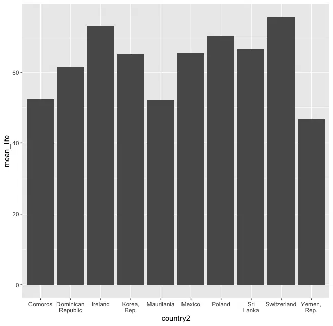
We can see the that x-axis tick labels are horizontal and are neatly separated.
Summary
Congratulations on reading to the end of this tutorial!
For further reading on plotting with R, go to the article:
Go to the online courses page on R to learn more about coding in R for data science and machine learning.
Have fun and happy researching!

Suf is a senior advisor in data science with deep expertise in Natural Language Processing, Complex Networks, and Anomaly Detection. Formerly a postdoctoral research fellow, he applied advanced physics techniques to tackle real-world, data-heavy industry challenges. Before that, he was a particle physicist at the ATLAS Experiment of the Large Hadron Collider. Now, he’s focused on bringing more fun and curiosity to the world of science and research online.