Table of Contents
Introduction
Logistic regression is a foundational algorithm in machine learning, originally designed for binary classification but widely adapted for multi-class tasks, such as digit recognition. In this detailed guide, we not only implement multi-class logistic regression using PyTorch but also take a deep dive into every aspect of the workflow. From exploring the MNIST dataset and visualizing patterns, to training, evaluation, and error analysis, this tutorial equips you with the tools and insights needed to fully understand and optimize logistic regression for multi-class classification. Whether you’re a beginner or looking to refine your skills, this step-by-step approach ensures a solid grasp of the concepts and practical implementation.
Mathematical Foundation
Logistic regression works by estimating probabilities. For a single class (binary classification), the probability is calculated using the sigmoid function:
\[ P(y = 1 \mid x) = \sigma(w \cdot x + b) \] \[ \text{where } \sigma(z) = \frac{1}{1 + e^{-z}} \]For multi-class problems, like predicting digits (0–9), we use the softmax function, which generalizes logistic regression to multiple classes:
\[ P(y = k \mid x) = \text{softmax}(w_k \cdot x + b_k) \] \[ \text{where } \text{softmax}(z)_k = \frac{e^{z_k}}{\sum_j e^{z_j}} \]These functions turn the model’s outputs (logits) into probabilities that sum to 1, helping the model decide which class is the most likely.
Key Concepts Made Simple
Here are the core components of logistic regression and how they fit into the process:
| Concept | Description | Why It Matters |
|---|---|---|
| Linear Transformation | $w \cdot x + b$ combines features into logits (raw scores). | Helps the model identify patterns in the data. |
| Softmax Function | Converts logits into probabilities for each class. | Allows the model to make predictions across multiple classes. |
| Cross-Entropy Loss | Measures how far the predicted probabilities are from the true labels. | Guides the model during training to improve accuracy. |
| Gradient Descent | An optimization algorithm that adjusts model parameters step-by-step. | Ensures the model learns by minimizing the loss function. |
Visual Explanation
def visualize_logistic_function():
    # Sigmoid function
    x = np.linspace(-10, 10, 100)
    sigmoid = 1 / (1 + np.exp(-x))

    # Plot sigmoid
    plt.figure(figsize=(12, 6))
    plt.subplot(1, 2, 1)
    plt.plot(x, sigmoid, label='Sigmoid')
    plt.title('Sigmoid Function')
    plt.xlabel('z = wx + b')
    plt.ylabel('σ(z)')
    plt.grid(True)
    plt.legend()

    # Softmax visualization for 3 classes
    z = np.linspace(-5, 5, 100)
    softmax_values = np.exp(np.stack([z, 0.5 * z, -0.5 * z], axis=1))
    softmax_values /= softmax_values.sum(axis=1, keepdims=True)

    plt.subplot(1, 2, 2)
    for i, color in enumerate(['r', 'g', 'b']):
        plt.plot(z, softmax_values[:, i], label=f'Class {i + 1}', color=color)
    plt.title('Softmax Function (3 Classes)')
    plt.xlabel('z = wx + b')
    plt.ylabel('Probability')
    plt.grid(True)
    plt.legend()

    plt.tight_layout()
    plt.show()

# Visualize logistic and softmax functions
visualize_logistic_function()
Understanding the Figures
1. Sigmoid Function
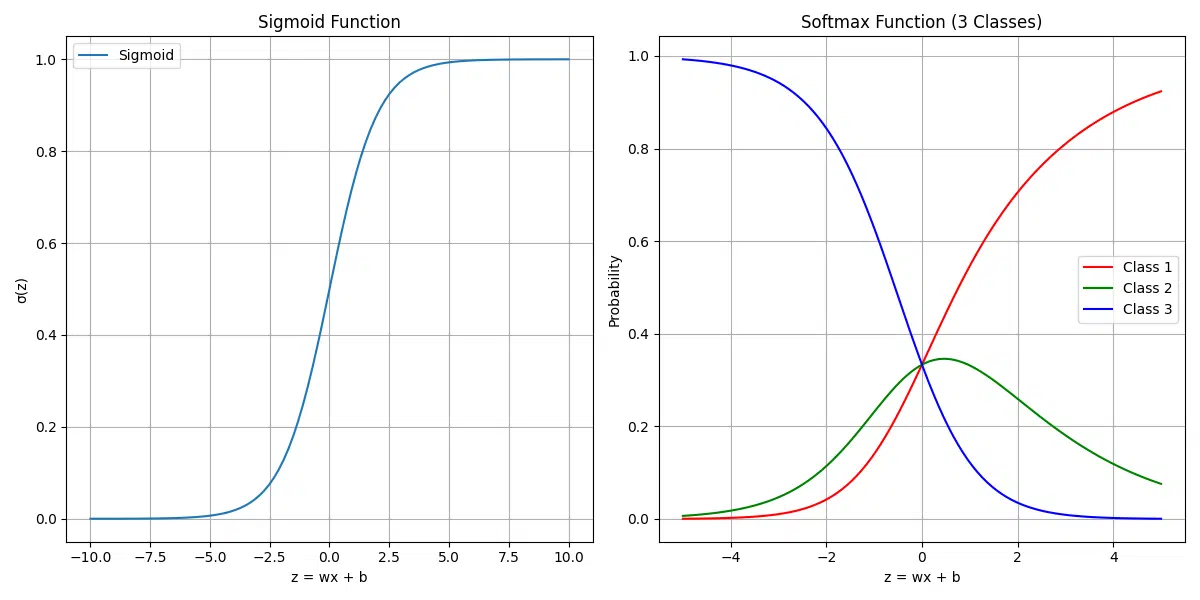
The sigmoid function is a key tool for binary classification. It takes an input value
(z = wx + b), transforms it into a probability between 0 and 1, and helps decide
between two classes. The curve is S-shaped:
- When
zis large and positive, the probability approaches 1. - When
zis large and negative, the probability approaches 0. - At
z = 0, the probability is 0.5, indicating uncertainty between classes.
This figure shows how the sigmoid function maps raw model outputs (logits) into probabilities, making them interpretable for binary decisions.
2. Softmax Function (3 Classes)
The softmax function extends the sigmoid concept to multi-class classification. It calculates probabilities for multiple classes, ensuring they sum to 1. In this figure:
- The x-axis represents the input logits (
z). - The y-axis shows the probability for each of three classes (Class 1, Class 2, Class 3).
- Each curve (red, green, blue) corresponds to one class’s probability as
zchanges.
The softmax function helps models assign probabilities to all possible classes, enabling multi-class predictions like digit recognition in MNIST.
Takeaway
These figures demonstrate how logistic regression transforms raw model outputs into probabilities. The sigmoid function works for binary classification, while the softmax function handles multi-class problems by normalizing probabilities across all classes.
Why Logistic Regression?
- Simple and interpretable model structure
- Probabilistic output
- Fast training and inference
- Good baseline for complex problems
- Works well for linearly separable data
- Assumes linear decision boundaries
- May underfit complex patterns
- Sensitive to feature scaling
- Requires feature engineering for nonlinear problems
The MNIST Challenge
The MNIST Challenge serves as a foundational benchmark in machine learning and pattern recognition. It involves training a model to classify handwritten digits (0–9) based on the following characteristics:
Task: Classify Handwritten Digits
- The objective is to correctly identify the digit represented in each image.
- This involves mapping pixel data to one of the 10 possible classes (digits 0–9).
Input: 28×28 Grayscale Images
- Each image is a 28×28 matrix of grayscale pixel values ranging from 0 (black) to 255 (white).
- These images capture handwritten digits, offering a compact and manageable dataset for experimentation.
Output: 10 Class Probabilities
- The goal is for the model to output probabilities for each of the 10 digits, indicating the likelihood of the image corresponding to each class.
- The class with the highest probability is taken as the model’s prediction.
Challenge: Handle Variations in Writing Styles
- Human handwriting is inherently diverse, with significant variations in:
- Stroke thickness: Differences in pen pressure and instrument type.
- Digit shapes: Variations in how individuals write the same digit (e.g., “7” with or without a crossbar).
- Slant or orientation: Slight tilts or rotations in the handwritten digits.
- Noise in images: Imperfections in the dataset, such as blurred or faint digits.
Why MNIST Is an Ideal Case Study for Logistic Regression
The MNIST dataset is a popular choice for logistic regression because it balances simplicity with practical challenges:
- Simplicity: Small and well-curated, MNIST’s 28×28 grayscale images are computationally efficient, making it beginner-friendly.
- Binary Core: Logistic regression, ideal for binary tasks, extends naturally to MNIST’s multi-class setup using softmax or one-vs-rest (OvR).
- Baseline Benchmark: MNIST offers a standard to evaluate logistic regression and compare it to advanced methods like neural networks.
- Practical Challenges: It highlights key issues in pattern recognition, such as feature extraction, generalization, and regularization.
Broader Impact of the MNIST Challenge
MNIST’s influence extends beyond its simplicity:
- Algorithm Comparison: Provides a standard benchmark for testing new models and architectures like convolutional neural networks.
- Education: A staple in tutorials and courses for introducing machine learning and deep learning concepts.
- Transfer Learning: Pretrained models on MNIST often serve as a foundation for tackling more complex datasets.
Working with MNIST is an essential step for mastering foundational concepts while addressing real-world classification challenges in a controlled environment.
Prerequisites
This tutorial assumes basic familiarity with:
- Python programming
- PyTorch framework
- Machine learning concepts
Additionally, ensure the following libraries and modules are installed and configured:
- NumPy: For numerical operations like array manipulations
- Matplotlib: For visualizing data and results
- SciPy: For advanced mathematical and statistical operations
- Scikit-learn: For evaluation metrics like precision, recall, and confusion matrices
- Torchvision: For loading and transforming the MNIST dataset
- Pandas: For handling tabular data during evaluations (optional but recommended)
- Seaborn: For advanced plotting and visualizations
- TQDM: For progress bars during training
- Statsmodels: For statistical testing (used in advanced evaluation)
pip install numpy
pip install matplotlib
pip install scipy
pip install scikit-learn
pip install torchvision
pip install pandas
pip install seaborn
pip install tqdm
pip install statsmodels
Dataset Overview
The MNIST (Modified National Institute of Standards and Technology) dataset is a large collection of handwritten digits that is commonly used for training various image processing systems. The dataset consists of:
- Training Set: 60,000 images
- Test Set: 10,000 images
- Image Size: 28×28 pixels (784 total pixels)
- Color Format: Grayscale (0-255 intensity values)
- Classes: 10 (digits 0-9)
Data Loading and Preprocessing
When working with deep learning tasks, proper data loading and preprocessing are crucial steps to ensure efficient model training and evaluation. Here, we focus on setting up the dataset, applying transformations, and splitting it into training, validation, and test sets while utilizing PyTorch’s utilities for optimal performance.
Let’s dive into the process step by step:
- Import Necessary Modules: We utilize PyTorch, torchvision, and other essential libraries to streamline the data loading and transformation pipeline.
- Define Transformations: The MNIST dataset images are normalized with their mean and standard deviation values. This step ensures faster convergence during training by standardizing the pixel values.
- Download and Load Datasets: The MNIST dataset is downloaded if not already available, and it is preprocessed using the defined transformations.
- Data Splitting: The training dataset is split into training and validation subsets based on the specified validation ratio. This allows us to monitor the model’s performance on unseen data during training.
- Create Data Loaders: Data loaders are configured for training, validation, and test sets to enable batch processing, shuffling, and parallel loading of data, improving overall efficiency.
# Import necessary modules
import torch
import torchvision
from torchvision import datasets, transforms
from torch.utils.data import DataLoader, random_split
import matplotlib.pyplot as plt

validation_split=0.1
num_workers=2
# Define our transformations
transform = transforms.Compose([
    transforms.ToTensor(),  # Convert PIL image to tensor and scale to [0, 1]
    transforms.Normalize(
        mean=(0.1307,),    # Mean of the MNIST dataset
        std=(0.3081,)      # Standard deviation of the MNIST dataset
    )
])

# Load and preprocess training data
train_dataset = torchvision.datasets.MNIST(
    root='./data',         # Directory to store the dataset
    train=True,           # Specify training set
    transform=transform,   # Apply our transformations
    download=True         # Download if not present
)

# Load and preprocess training data
test_dataset = torchvision.datasets.MNIST(
    root='./data',         # Directory to store the dataset
    train=False,           # Specify training set
    transform=transform,   # Apply our transformations
)

# Load and preprocess test data
test_dataset = torchvision.datasets.MNIST(
    root='./data',
    train=False,
    transform=transform
)

# Split training dataset into train and validation sets
train_size = int(len(train_dataset) * (1 - validation_split))
val_size = len(train_dataset) - train_size
train_subset, val_subset = random_split(train_dataset, [train_size, val_size])


# Create data loaders for batch processing
train_loader = DataLoader(
    train_dataset,
    batch_size=64,        # Number of samples per batch
    shuffle=True,         # Shuffle training data
    num_workers=2         # Number of subprocesses for data loading
)

val_loader = DataLoader(
    val_subset,
    batch_size=64,
    shuffle=False,
    num_workers=num_workers
)


test_loader = DataLoader(
    test_dataset,
    batch_size=64,
    shuffle=False         # No need to shuffle test data
)
Running this will download the MNIST datasets and prepare your training, validation and test data.
Downloading https://ossci-datasets.s3.amazonaws.com/mnist/train-images-idx3-ubyte.gz to ./data/MNIST/raw/train-images-idx3-ubyte.gz
100%|█████████████████████████████| 9912422/9912422 [00:18<00:00, 542742.46it/s]
Extracting ./data/MNIST/raw/train-images-idx3-ubyte.gz to ./data/MNIST/raw
- Use appropriate batch sizes based on your available memory (64-256 is common)
- Enable shuffling for training data to prevent learning sequence patterns
- Utilize multiple workers (num_workers) for faster data loading on multi-core systems
- Pin memory (pin_memory=True) when using CUDA for faster data transfer to GPU
Visualizing the Dataset
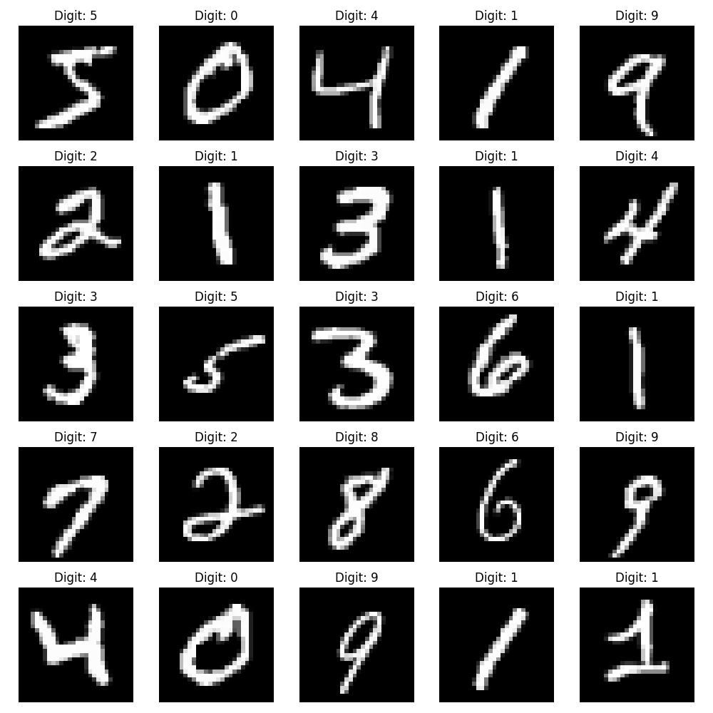
Before diving into model training, it is often helpful to visualize the dataset. Visualizing sample images allows us to confirm that the data has been loaded and preprocessed correctly and provides insights into the structure of the data.
Below, we create a simple function to display a grid of images from the dataset, along with their corresponding labels:
- Random Sample Selection: The function selects a specified number of samples from the dataset for visualization.
- Grid Display: The images are displayed in a 5×5 grid using Matplotlib.
- Label Annotation: Each image is annotated with its corresponding label to provide context.
import torch
def visualize_samples(dataset, num_samples=25):
    # Create a figure
    plt.figure(figsize=(10, 10))

    # Display random samples in a grid
    for i in range(num_samples):
        plt.subplot(5, 5, i + 1)
        img, label = dataset[i]
        plt.imshow(img.squeeze(), cmap='gray')
        plt.title(f'Digit: {label}')
        plt.axis('off')

    plt.tight_layout()
    plt.show()

# Visualize samples from the training set
visualize_samples(train_dataset)
Understanding the Data Structure
Let’s examine the structure of our loaded data:
# Get a batch of training data
images, labels = next(iter(train_loader))

print(f"Batch shape: {images.shape}")
print(f"Labels shape: {labels.shape}")

# Sample output:
# Batch shape: torch.Size([64, 1, 28, 28])
# Labels shape: torch.Size([64])Labels shape: torch.Size([64])
- The
[64, 1, 28, 28]batch shape for the images indicates:- 64: The batch size, i.e., the number of images in one batch.
- 1: The number of channels in each image. Since MNIST is grayscale, there is only one channel.
- 28, 28: The height and width of each image in pixels (28×28).
- The
[64]shape for the labels indicates that each image in the batch has a corresponding label. In this case, there are 64 labels in total, one for each image in the batch.
Dataset Statistics
| Metric | Value |
|---|---|
| Number of Training Examples | 60,000 |
| Number of Test Examples | 10,000 |
| Image Dimensions | 28×28 pixels |
| Number of Classes | 10 (0-9) |
| Samples per Class | ~6,000 (training), ~1,000 (test) |
- Forgetting to normalize the data
- Not shuffling the training data
- Using too large or too small batch sizes
- Not accounting for the imbalanced nature of the dataset (though MNIST is fairly balanced)
Exploratory Data Analysis (EDA)
Before building our model, let’s perform a thorough analysis of the MNIST dataset to better understand its characteristics and potential challenges.
Class Distribution Analysis
Before building our model, it’s essential to understand the distribution of classes within the MNIST dataset. This analysis helps us identify any potential class imbalances that could affect model performance. The MNIST dataset consists of handwritten digits (0-9), and by visualizing their distribution, we can ensure that all classes are adequately represented.
def analyze_class_distribution(dataset):
    # Count samples in each class
    labels = [label for _, label in dataset]
    class_counts = torch.bincount(torch.tensor(labels))

    # Create distribution plot
    plt.figure(figsize=(10, 6))
    plt.bar(range(10), class_counts)
    plt.title('Distribution of Digits in MNIST Dataset')
    plt.xlabel('Digit')
    plt.ylabel('Number of Samples')
    plt.grid(True, alpha=0.3)
    plt.show()

    # Print class statistics
    print("\nClass Distribution Statistics:")
    for digit in range(10):
        percentage = (class_counts[digit] / len(dataset)) * 100
        print(f"Digit {digit}: {class_counts[digit]} samples ({percentage:.1f}%)")

analyze_class_distribution(train_dataset)
The visualization generated from this code shows a bar chart representing the frequency of each digit (0-9) in the dataset. Additionally, a summary of class statistics is printed, providing the total count and percentage for each digit. This ensures a balanced dataset and reveals whether additional preprocessing or adjustments are necessary.
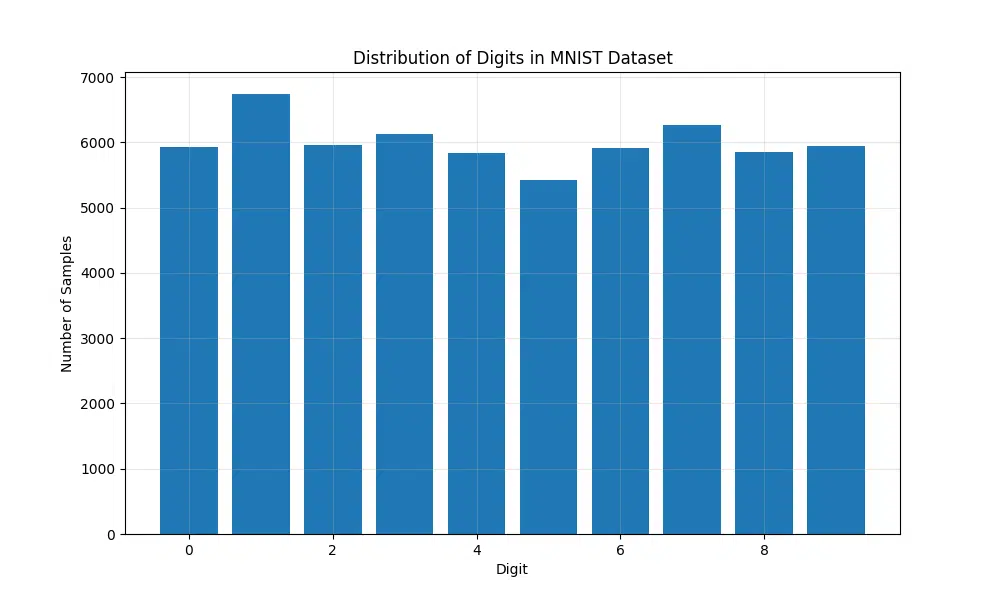
Digit 0: 5923 samples (9.9%)
Digit 1: 6742 samples (11.2%)
Digit 2: 5958 samples (9.9%)
Digit 3: 6131 samples (10.2%)
Digit 4: 5842 samples (9.7%)
Digit 5: 5421 samples (9.0%)
Digit 6: 5918 samples (9.9%)
Digit 7: 6265 samples (10.4%)
Digit 8: 5851 samples (9.8%)
Digit 9: 5949 samples (9.9%)
From these statistics, we can observe that the dataset is evenly distributed among the 10 classes, with the percentages ranging from 9.0% to 11.2%. This ensures that the model will not be biased toward any particular digit during training.
Pixel Value Analysis
Analyzing the pixel values of the MNIST dataset provides insight into the distribution and variation of the pixel intensities, which are critical for designing robust preprocessing steps such as normalization. By calculating the mean and standard deviation of pixel values across the dataset, we can normalize the data effectively, improving the performance and stability of the training process.
The following code calculates per-pixel mean and standard deviation, as well as global statistics for a subset of the dataset, and visualizes these statistics to better understand pixel intensity patterns:
def analyze_pixel_statistics(dataset, num_samples=1000):
    # Sample images for analysis
    images = torch.stack([img for img, _ in torch.utils.data.Subset(dataset,
                        range(num_samples))])

    # Calculate statistics
    mean_per_pixel = torch.mean(images, dim=0)
    std_per_pixel = torch.std(images, dim=0)
    global_mean = torch.mean(images)
    global_std = torch.std(images)

    # Visualize mean pixel values
    plt.figure(figsize=(12, 4))

    plt.subplot(1, 2, 1)
    plt.imshow(mean_per_pixel.squeeze(), cmap='viridis')
    plt.title('Mean Pixel Values')
    plt.colorbar()

    plt.subplot(1, 2, 2)
    plt.imshow(std_per_pixel.squeeze(), cmap='viridis')
    plt.title('Pixel Standard Deviations')
    plt.colorbar()

    plt.tight_layout()
    plt.show()

    return global_mean, global_std

mean, std = analyze_pixel_statistics(train_dataset)
print(f"Global Mean: {mean:.4f}")
print(f"Global Standard Deviation: {std:.4f}")
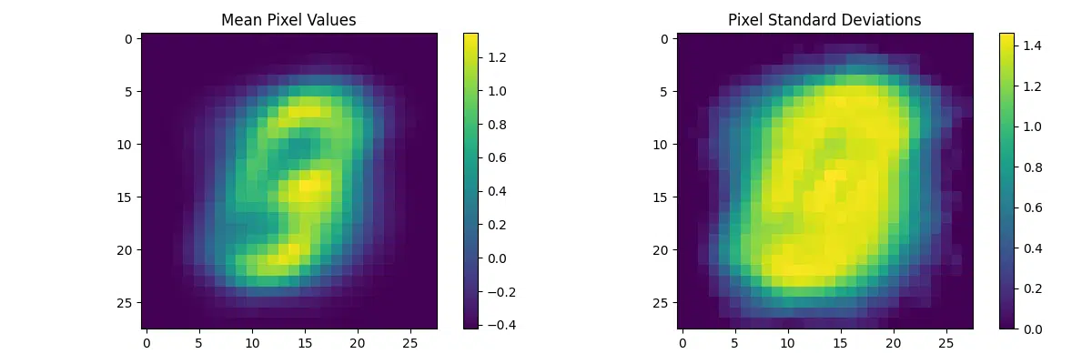
- Mean Pixel Values: The first visualization highlights the average intensity values for each pixel across the sampled dataset. This provides an idea of which regions of the images tend to be brighter or darker on average, reflecting patterns in the digit shapes.
- Pixel Standard Deviations: The second visualization shows the variation in intensity for each pixel. Regions with high variance are typically edges or areas with varying handwriting styles, while low-variance regions correspond to consistent backgrounds.
- Global Statistics: The calculated global mean and standard deviation are useful for dataset normalization, ensuring that the input data has zero mean and unit variance, which accelerates convergence during training.
Global Standard Deviation: 0.9904
These values indicate that the dataset has already been normalized, with a near-zero mean and a standard deviation close to 1. This confirms the preprocessing step effectively scaled the pixel values, making them suitable for model training.
Digit Characteristics Analysis
Exploring the unique characteristics of each digit in the MNIST dataset provides valuable insights into the dataset’s structure and helps identify potential challenges during model training. By averaging the shapes of each digit, we can visualize their general structure and observe patterns, such as stroke consistency or variability between samples.
The following code snippet selects multiple samples for each digit (0-9) from the dataset, computes the average shape for each digit, and visualizes the results. This gives us a clearer picture of how the digits differ in appearance on average:
def analyze_digit_characteristics(dataset, samples_per_digit=10):
    # Create figure
    plt.figure(figsize=(15, 8))

    # Get samples for each digit
    digit_samples = {i: [] for i in range(10)}
    for img, label in dataset:
        if len(digit_samples[label]) < samples_per_digit:
            digit_samples[label].append(img)

        if all(len(samples) >= samples_per_digit for samples in digit_samples.values()):
            break

    # Plot average digit shapes
    for digit in range(10):
        # Calculate average shape
        avg_digit = torch.mean(torch.stack(digit_samples[digit]), dim=0)

        plt.subplot(2, 5, digit + 1)
        plt.imshow(avg_digit.squeeze(), cmap='gray')
        plt.title(f'Average Digit {digit}')
        plt.axis('off')

    plt.tight_layout()
    plt.show()

analyze_digit_characteristics(train_dataset)
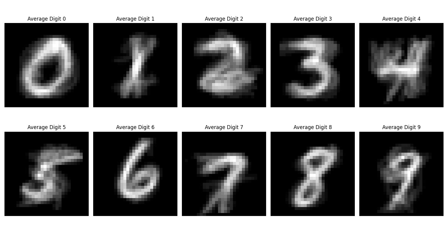
- Average Shape of Digits: Each subplot represents the average pixel intensity for a specific digit (0-9). Brighter regions indicate where strokes are more consistent across samples, while darker regions highlight areas with variability due to handwriting differences.
- Patterns in Variability: Certain digits, such as “1,” show clear, narrow strokes, reflecting less variability in handwriting styles. In contrast, digits like “8” or “5” display broader, more varied strokes due to the complex nature of their structure.
- Potential Challenges: Overlapping strokes in digits like “4” and “9” or “5” and “6” could lead to confusion during classification. Recognizing these patterns helps refine preprocessing and model architecture to mitigate misclassification risks.
This analysis is particularly useful for understanding class-specific challenges in the dataset. For example, digits with more distinct average shapes (e.g., “1” and “7”) are easier for models to classify, whereas digits with overlapping regions (e.g., “4” and “9”) may require additional features or preprocessing techniques to improve differentiation.
Data Quality Analysis
Ensuring the quality of the input data is a critical step in building effective machine learning models. For the MNIST dataset, data quality can be evaluated by analyzing key metrics such as image brightness and contrast. These metrics provide insights into potential variations in image intensity and sharpness that could impact model performance.
The following code snippet computes brightness and contrast for a sample of images from the dataset and visualizes their distributions. Brightness is defined as the mean pixel intensity, while contrast is measured as the standard deviation of pixel intensities. By analyzing these metrics, we can identify potential outliers or inconsistencies in the dataset:
def analyze_data_quality(dataset, num_samples=1000):
    # Sample images
    sample_imgs = [img for img, _ in torch.utils.data.Subset(dataset, range(num_samples))]

    # Calculate quality metrics
    brightness_values = []
    contrast_values = []

    for img in sample_imgs:
        # Calculate brightness (mean pixel value)
        brightness = torch.mean(img)
        brightness_values.append(brightness.item())

        # Calculate contrast (standard deviation of pixel values)
        contrast = torch.std(img)
        contrast_values.append(contrast.item())

    # Plot distributions
    plt.figure(figsize=(12, 4))

    plt.subplot(1, 2, 1)
    plt.hist(brightness_values, bins=50)
    plt.title('Distribution of Image Brightness')
    plt.xlabel('Brightness')
    plt.ylabel('Count')

    plt.subplot(1, 2, 2)
    plt.hist(contrast_values, bins=50)
    plt.title('Distribution of Image Contrast')
    plt.xlabel('Contrast')
    plt.ylabel('Count')

    plt.tight_layout()
    plt.show()

analyze_data_quality(train_dataset)
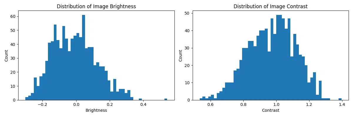
- Brightness Distribution: The brightness histogram reveals the range and frequency of average pixel intensities across the images. A narrow distribution centered around a consistent brightness level suggests uniform lighting conditions in the dataset.
- Contrast Distribution: The contrast histogram indicates how much pixel intensity varies within individual images. Higher contrast typically means clearer digit boundaries, whereas lower contrast may result in blurry or less distinguishable digits.
- Identifying Outliers: Images with extremely low brightness or contrast may indicate issues such as poorly scanned or faded digits. These outliers could negatively impact the model’s ability to generalize and may require additional preprocessing steps.
This analysis helps ensure that the dataset is clean and consistent, providing a solid foundation for model training. By identifying brightness and contrast anomalies early, we can address potential issues such as normalization or augmentation requirements to improve the robustness of the model.
- Class Distribution:
- The dataset is well-balanced across all digits
- Each digit has approximately 6,000 training samples
- Pixel Statistics:
- Most pixel values are concentrated near 0 (black)
- The center of the images shows more variation
- Image Quality:
- Consistent image quality across samples
- Good contrast between digits and background
Feature Engineering Insights
| Characteristic | Impact on Model | Recommendation |
|---|---|---|
| Pixel Value Range | High variance in raw values | Normalize to [0,1] range |
| Class Balance | Well-balanced dataset | No need for class weights |
| Image Contrast | Good separation of features | Standard preprocessing sufficient |
| Spatial Distribution | Digits centered in image | No need for additional alignment |
- While the dataset is well-prepared, some digits (like 1 and 7) may be more easily confused
- The centered nature of the digits means we don’t need complex positioning preprocessing
- The consistent image quality suggests we can use simpler model architectures
- The balanced nature of the dataset means we don’t need to handle class imbalance
Performance Implications
Based on our EDA, we can make several decisions about our model architecture and training approach:
- Use standard normalization (mean=0.1307, std=0.3081)
- No need for data augmentation due to dataset size and quality
- Simple architecture should be sufficient
- Can use standard cross-entropy loss without class weights
Building the Model
Let’s dive deep into building our logistic regression model for MNIST digit classification. We’ll explore the architecture, implementation details, and the mathematical concepts behind the model.
Model Architecture
First, let’s visualize our model architecture using a Mermaid diagram:

Model Implementation
The next step in our pipeline is to implement a simple logistic regression model for the MNIST dataset. Logistic regression serves as a foundational approach to multi-class classification tasks and is an excellent starting point for understanding performance on this dataset. By transforming the 2D image data into a 1D vector and applying a linear layer, the model predicts the probability of each digit (0-9). This section also incorporates proper weight initialization techniques to ensure stable and efficient training.
import torch.nn as nn

class LogisticRegression(nn.Module):
    def __init__(self, input_dim=784, num_classes=10):
        super(LogisticRegression, self).__init__()

        # Flatten layer to convert 2D images to 1D vectors
        self.flatten = nn.Flatten()

        # Linear layer for classification
        self.linear = nn.Linear(input_dim, num_classes)

        # Initialize weights using Xavier initialization
        nn.init.xavier_uniform_(self.linear.weight)
        nn.init.zeros_(self.linear.bias)

    def forward(self, x):
        # Flatten the input image
        x = self.flatten(x)  # Shape: [batch_size, 784]

        # Apply linear transformation
        logits = self.linear(x)  # Shape: [batch_size, 10]

        return logits

    def predict_proba(self, x):
        # Get logits
        logits = self.forward(x)

        # Apply softmax to get probabilities
        return F.softmax(logits, dim=1)
- Flatten Layer: Transforms 28×28 images into 784-dimensional vectors
- Linear Layer: Applies the transformation $W \cdot x + b$
- Xavier Initialization: Helps maintain variance across layers
- Softmax: Converts logits to probabilities (applied in loss function)
Mathematical Foundation
The logistic regression model is grounded in the principles of linear transformations and probabilistic classification using the softmax function. This allows the model to assign probabilities to each class and make predictions based on the highest probability. Below are the core mathematical components:
- Linear Transformation: Combines the input features x with weights W and a bias b to produce logits (z). \[ z = W \cdot x + b \quad \text{(Linear transformation)} \]
- Softmax Function: Converts logits into probabilities for each class, ensuring the probabilities sum to 1. \[ p(y = k \mid x) = \text{softmax}(z) \quad \text{(Probability for class } k\text{)} \] \[ \text{softmax}(z)_k = \frac{\exp(z_k)}{\sum_j \exp(z_j)} \quad \text{(Softmax function)} \]
- Cross-Entropy Loss: Measures the difference between predicted probabilities and true labels, guiding the optimization process to minimize this loss. \[ L = -\sum_i y_i \log(p_i) \quad \text{(Cross-entropy loss, where } y_i \text{ is the true label)} \]
These equations ensure that the model not only learns to classify the digits effectively but also quantifies uncertainty in its predictions, which is particularly useful in probabilistic modeling tasks.
Model Configuration
The configuration process for our logistic regression model involves defining the model, loss function, and optimizer. This setup ensures the model is ready for training and optimization. Let’s break it down:
-
Model Initialization: The logistic regression model is initialized using the
LogisticRegressionclass. This establishes the architecture of the model, including the input and output dimensions. -
Loss Function: We use the
CrossEntropyLoss, a standard loss function for classification tasks. It measures the difference between predicted probabilities and the true labels, guiding the model to improve its predictions. -
Optimizer: The optimizer chosen is
SGD(Stochastic Gradient Descent), configured with a learning rate and momentum. The learning rate determines the step size during optimization, while momentum helps accelerate convergence by mitigating oscillations.
Additionally, the total number of parameters in the model is calculated and printed to give insights into the model’s complexity. Understanding the parameter count is crucial for evaluating the computational cost and potential overfitting risks.
import torch.optim as optim
def setup_model(learning_rate=0.01, momentum=0.9):
    # Initialize model
    model = LogisticRegression()

    # Define loss function
    criterion = nn.CrossEntropyLoss()

    # Define optimizer
    optimizer = optim.SGD(
        model.parameters(),
        lr=learning_rate,
        momentum=momentum
    )

    return model, criterion, optimizer

# Create model instance and configure training
model, criterion, optimizer = setup_model()

# Print model architecture
print(model)

# Calculate total parameters
total_params = sum(p.numel() for p in model.parameters())
print(f"Total parameters: {total_params:,}")
(flatten): Flatten(start_dim=1, end_dim=-1)
(linear): Linear(in_features=784, out_features=10, bias=True)
)
Total parameters: 7,850
After setting up the model, you can inspect its architecture and verify the number of trainable parameters to ensure that the model meets your requirements before training.
- Loss Function: CrossEntropyLoss combines LogSoftmax and NLLLoss
- Optimizer: SGD with momentum for faster convergence
- Learning Rate: 0.01 is a good starting point for this architecture
- Momentum: 0.9 helps overcome local minima
- Not initializing weights properly
- Using inappropriate learning rates
- Forgetting to flatten the input images
- Not normalizing input data
Model Complexity Analysis
Understanding the memory footprint of a model is crucial for ensuring efficient deployment, especially on devices with limited resources. For our logistic regression model, the memory usage is calculated as follows:
| Component | Parameters | Memory (32-bit) |
|---|---|---|
| Linear Layer Weights | 784 × 10 = 7,840 | 30.62 KB |
| Linear Layer Bias | 10 | 0.04 KB |
| Total | 7,850 | 30.66 KB |
The total memory usage is 30.66 KB, making this model highly efficient and suitable for lightweight applications. To verify or automate these calculations, we can use the following Python function:
def calculate_model_memory(model):
    # Get total number of parameters
    total_params = sum(p.numel() for p in model.parameters())

    # Calculate memory in bytes (32-bit floating-point)
    memory_bytes = total_params * 4  # 4 bytes per FP32 parameter

    # Convert to KB
    memory_kb = memory_bytes / 1024

    print(f"Total Parameters: {total_params}")
    print(f"Memory Usage: {memory_kb:.2f} KB")

# Example usage
calculate_model_memory(model)
This function computes the total parameters and their memory usage programmatically. Using this, we confirmed that the model has 7,850 parameters and consumes approximately 30.66 KB of memory.
- Lightweight architecture with minimal parameters
- Linear memory and computation complexity
- Easily deployable on resource-constrained devices
- Fast inference time due to simple architecture
Training the Model
Training a model effectively involves careful planning and configuration of hyperparameters, along with mechanisms to monitor progress and evaluate performance. Below, we define a robust training configuration that incorporates essential parameters like learning rate scheduling, early stopping, and logging intervals. These settings help ensure the training process is efficient, avoids overfitting, and adjusts the learning dynamics when needed.
Training Configuration
The following Python class encapsulates the key parameters required for configuring the training process. This design allows easy adjustments and centralizes all relevant settings in a single place, ensuring maintainability and readability.
class TrainingConfig:
    def __init__(self):
        self.num_epochs = 30  # Total number of training epochs
        self.batch_size = 64  # Number of samples per batch
        self.learning_rate = 0.01  # Initial learning rate
        self.momentum = 0.9  # Momentum for SGD optimizer
        self.log_interval = 100  # Interval (in batches) for logging progress
        self.validation_split = 0.1  # Percentage of training data used for validation
        self.early_stopping_patience = 5  # Number of epochs with no improvement before stopping
        self.learning_rate_decay = 0.1  # Factor to decay learning rate
        self.learning_rate_step = 10  # Number of epochs before applying learning rate decay

config = TrainingConfig()
Key Hyperparameters
Here’s a breakdown of the parameters and their importance in training:
- num_epochs: The total number of times the entire dataset is passed through the model. A higher number may improve accuracy but risks overfitting.
- batch_size: The number of samples processed at a time. A smaller batch size requires less memory but may lead to noisier gradient updates.
- learning_rate: Determines the step size at each iteration while moving toward a minimum in the loss function.
- momentum: Helps accelerate convergence and stabilize updates by considering the past gradients.
- log_interval: Defines how often progress information (e.g., loss, accuracy) is printed or logged.
- validation_split: Allocates a portion of training data for validation to monitor overfitting and generalization.
- early_stopping_patience: Stops training if the model shows no improvement for a set number of epochs, preventing unnecessary computation.
- learning_rate_decay: Reduces the learning rate by a specified factor, aiding in fine-tuning during later epochs.
- learning_rate_step: Indicates the interval (in epochs) at which learning rate decay is applied.
Benefits of This Configuration
By incorporating features like early stopping and learning rate scheduling, this configuration ensures a balanced training process that avoids overfitting and stagnation. Additionally, the structured approach promotes experimentation with different hyperparameters to optimize the model’s performance.
Training Loop Implementation
The training loop is a critical component of the machine learning pipeline, responsible for iteratively optimizing the model parameters, monitoring progress, and evaluating performance. This implementation includes essential features like learning rate scheduling, early stopping, and a clear separation of training and validation steps, ensuring a balanced and efficient workflow. By incorporating these features, we can prevent overfitting, optimize training time, and improve model generalization.
Below is a detailed implementation of the training loop encapsulated within a `Trainer` class. This modular design not only simplifies training but also makes it easier to track performance metrics, save the best-performing model, and adapt to different configurations.
Key Features:
- Training Epoch: Handles the forward and backward passes for each batch, updates model parameters, and calculates training loss and accuracy.
- Validation Step: Evaluates the model on validation data without updating parameters, ensuring unbiased performance monitoring.
- Progress Monitoring: Uses a progress bar to provide real-time feedback during training.
- Early Stopping: Stops training if validation loss does not improve for a specified number of epochs, saving computational resources.
- Learning Rate Scheduling: Dynamically adjusts the learning rate at specified intervals to fine-tune the optimization process.
- Model Checkpointing: Saves the best model based on validation loss for later use or deployment.
class Trainer:
    def __init__(self, model, criterion, optimizer, config):
        self.model = model
        self.criterion = criterion
        self.optimizer = optimizer
        self.config = config
        self.device = torch.device('cuda' if torch.cuda.is_available() else 'cpu')
        self.model.to(self.device)

        # Initialize trackers
        self.train_losses = []
        self.val_losses = []
        self.train_accuracies = []
        self.val_accuracies = []

    def train_epoch(self, train_loader):
        self.model.train()
        running_loss = 0.0
        correct = 0
        total = 0

        # Progress bar
        pbar = tqdm(train_loader, desc='Training')

        for batch_idx, (data, target) in enumerate(pbar):
            data, target = data.to(self.device), target.to(self.device)

            # Zero the gradients
            self.optimizer.zero_grad()

            # Forward pass
            output = self.model(data)
            loss = self.criterion(output, target)

            # Backward pass and optimize
            loss.backward()
            self.optimizer.step()

            # Update metrics
            running_loss += loss.item()
            _, predicted = output.max(1)
            total += target.size(0)
            correct += predicted.eq(target).sum().item()

            # Update progress bar
            pbar.set_postfix({
                'loss': running_loss/(batch_idx+1),
                'acc': 100.*correct/total
            })

        return running_loss/len(train_loader), 100.*correct/total

    def validate(self, val_loader):
        self.model.eval()
        val_loss = 0
        correct = 0
        total = 0

        with torch.no_grad():
            for data, target in val_loader:
                data, target = data.to(self.device), target.to(self.device)
                output = self.model(data)
                val_loss += self.criterion(output, target).item()
                _, predicted = output.max(1)
                total += target.size(0)
                correct += predicted.eq(target).sum().item()

        return val_loss/len(val_loader), 100.*correct/total

    def train(self, train_loader, val_loader):
        best_val_loss = float('inf')
        patience_counter = 0

        for epoch in range(self.config.num_epochs):
            # Train one epoch
            train_loss, train_acc = self.train_epoch(train_loader)
            val_loss, val_acc = self.validate(val_loader)

            # Store metrics
            self.train_losses.append(train_loss)
            self.val_losses.append(val_loss)
            self.train_accuracies.append(train_acc)
            self.val_accuracies.append(val_acc)

            # Print progress
            print(f'\nEpoch: {epoch+1}/{self.config.num_epochs}')
            print(f'Train Loss: {train_loss:.4f}, Train Acc: {train_acc:.2f}%')
            print(f'Val Loss: {val_loss:.4f}, Val Acc: {val_acc:.2f}%')

            # Learning rate scheduling
            if (epoch + 1) % self.config.learning_rate_step == 0:
                for param_group in self.optimizer.param_groups:
                    param_group['lr'] *= self.config.learning_rate_decay
                print(f'Learning rate adjusted to {param_group["lr"]}')

            # Early stopping
            if val_loss < best_val_loss:
                best_val_loss = val_loss
                patience_counter = 0
                # Save best model
                torch.save(self.model.state_dict(), 'best_model.pth')
            else:
                patience_counter += 1
                if patience_counter >= self.config.early_stopping_patience:
                    print('Early stopping triggered')
                    break

        return self.train_losses, self.val_losses, self.train_accuracies, self.val_accuracies
Training Visualization
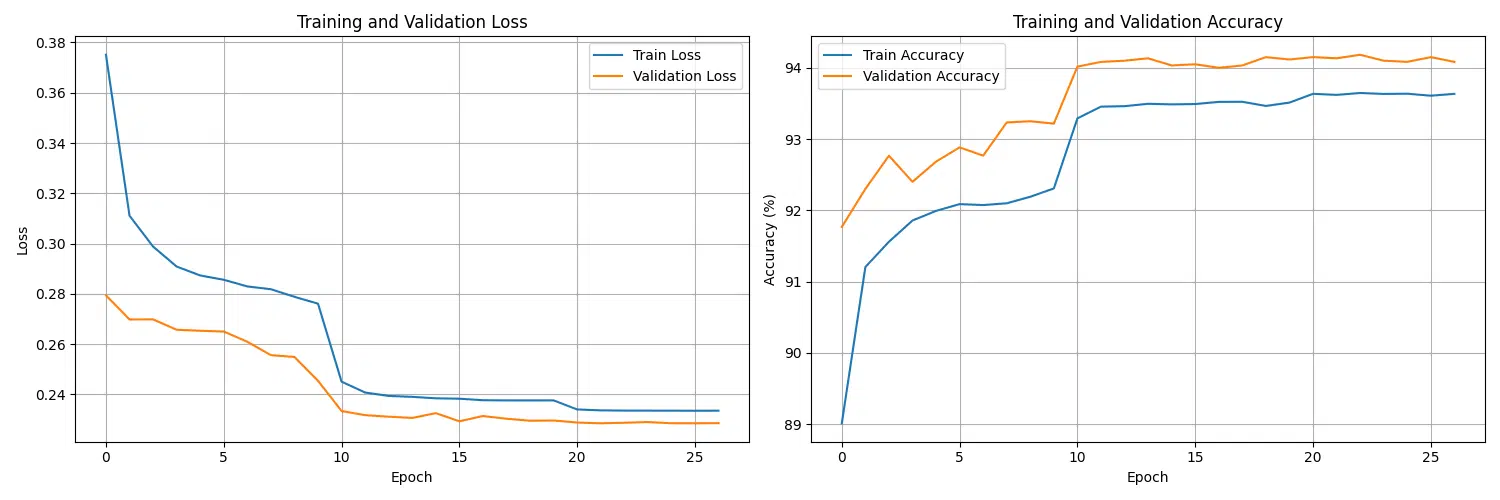
Visualizing training progress is a crucial step in understanding how well the model is learning over time. By plotting both training and validation metrics such as loss and accuracy, we can identify patterns such as overfitting, underfitting, or stable convergence. These insights help in adjusting hyperparameters and improving the overall training pipeline.
The visualization includes:
- Loss Curves: Tracks the training and validation loss across epochs to monitor how the model is minimizing the error.
- Accuracy Curves: Displays the model’s performance on training and validation datasets in terms of classification accuracy.
Below is the implementation of a function to plot these metrics for better progress monitoring:
from tqdm import tqdm

def plot_training_progress(trainer):
    fig, (ax1, ax2) = plt.subplots(1, 2, figsize=(15, 5))

    # Plot losses
    ax1.plot(trainer.train_losses, label='Train Loss')
    ax1.plot(trainer.val_losses, label='Validation Loss')
    ax1.set_xlabel('Epoch')
    ax1.set_ylabel('Loss')
    ax1.set_title('Training and Validation Loss')
    ax1.legend()
    ax1.grid(True)

    # Plot accuracies
    ax2.plot(trainer.train_accuracies, label='Train Accuracy')
    ax2.plot(trainer.val_accuracies, label='Validation Accuracy')
    ax2.set_xlabel('Epoch')
    ax2.set_ylabel('Accuracy (%)')
    ax2.set_title('Training and Validation Accuracy')
    ax2.legend()
    ax2.grid(True)

    plt.tight_layout()
    plt.show()

# Initialize and run training
model = LogisticRegression()
criterion = nn.CrossEntropyLoss()
optimizer = optim.SGD(model.parameters(), lr=config.learning_rate, momentum=config.momentum)
trainer = Trainer(model, criterion, optimizer, config)

# Train the model
trainer.train(train_loader, val_loader)

# Plot training progress
plot_training_progress(trainer)
Key Observations from Visualization:
- Convergence: If both the training and validation loss curves are decreasing smoothly, the model is learning effectively.
- Overfitting Detection: A large gap between training and validation loss or accuracy indicates overfitting. Regularization techniques may be needed.
- Learning Rate Adjustments: If the curves plateau too early, a learning rate adjustment might help to improve optimization.
This visualization ensures that training metrics are not only logged but also interpreted in a meaningful way, allowing for iterative improvement of the model’s performance.
- Use learning rate scheduling to improve convergence
- Implement early stopping to prevent overfitting
- Monitor both training and validation metrics
- Save the best model based on validation performance
Learning Rate Analysis
Choosing the right learning rate is critical for effective model training. A learning rate that is too low may result in slow convergence, while a learning rate that is too high could lead to instability or divergence. To address this, we can use a learning rate finder to systematically identify the range of learning rates where the model achieves the fastest loss reduction.
The learning rate finder works by gradually increasing the learning rate during a single training loop and plotting the resulting loss against the learning rate. This approach helps identify the optimal range of learning rates to use during training.
import numpy as np
def find_optimal_lr(model, train_loader, criterion, init_lr=1e-7, final_lr=10, beta=0.98):
    lrs = []
    losses = []
    log_lrs = np.linspace(np.log10(init_lr), np.log10(final_lr), 100)
    optimizer = optim.SGD(model.parameters(), lr=init_lr)

    # Training loop with increasing learning rate
    for lr in tqdm(log_lrs):
        optimizer.param_groups[0]['lr'] = 10**lr

        # Forward pass
        data, target = next(iter(train_loader))
        optimizer.zero_grad()
        output = model(data)
        loss = criterion(output, target)

        # Backward pass
        loss.backward()
        optimizer.step()

        # Store values
        lrs.append(10**lr)
        losses.append(loss.item())

    # Plot results
    plt.figure(figsize=(10, 5))
    plt.semilogx(lrs, losses)
    plt.xlabel('Learning Rate')
    plt.ylabel('Loss')
    plt.title('Learning Rate vs Loss')
    plt.grid(True)
    plt.show()

# Find optimal learning rate
find_optimal_lr(model, train_loader, criterion)
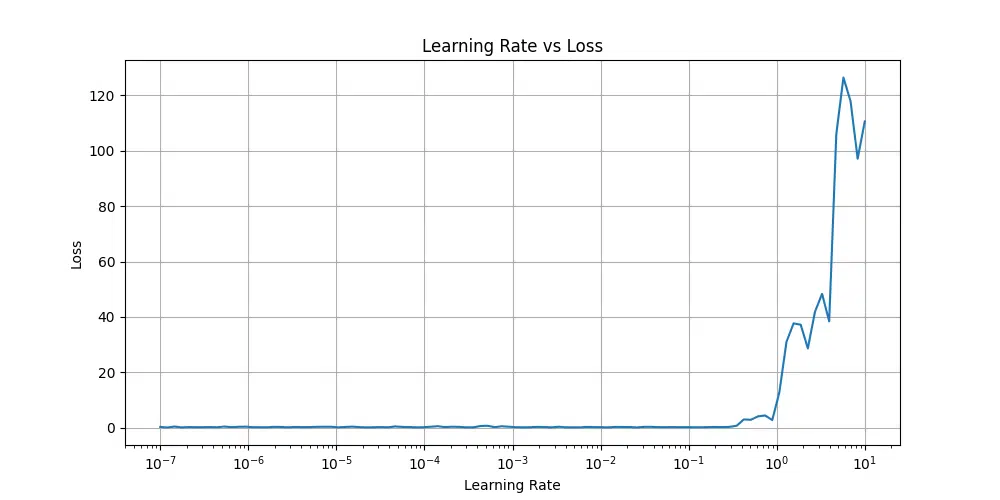
At very low learning rates, the loss remains flat, indicating insufficient updates to weights. As the learning rate increases, the loss starts decreasing and reaches a stable region. Beyond a certain point, the loss begins to rise rapidly, suggesting the learning rate is too high and the model becomes unstable.
Ideal Learning Rate: The ideal learning rate is just before the loss starts increasing sharply. From the plot you provided, this occurs roughly between 10$^{-2}$ and 10$^{-1}$.
Specific Learning Rate: If you are using a learning rate finder (e.g., lr_find in PyTorch Lightning or FastAI), you can pick a learning rate slightly smaller than the point where the loss starts to increase significantly. For this plot, a value like 0.01 (10$^{-2}$) would be a good starting point for training.
Batch Size Analysis
The batch size plays a crucial role in training a model, affecting memory usage, training speed, and the model’s ability to generalize. Selecting an appropriate batch size requires balancing these factors to optimize performance and resource utilization.
Below is an analysis of different batch sizes and their impact on training:
| Batch Size | Memory Usage | Training Speed | Convergence |
|---|---|---|---|
| 32 | Low | Slower | Better generalization |
| 64 | Medium | Balanced | Good compromise |
| 128 | High | Faster | Potentially worse generalization |
Key Considerations:
- Memory Usage: Smaller batch sizes require less memory, making them suitable for systems with limited GPU or RAM resources. Larger batch sizes, while memory-intensive, allow for faster training iterations by processing more data simultaneously.
- Training Speed: Larger batch sizes typically lead to faster training speeds per epoch since they leverage the parallel processing capabilities of modern hardware. However, the computational cost per batch increases.
- Convergence and Generalization: Smaller batch sizes often lead to better generalization as they introduce more stochasticity in the gradient updates, preventing overfitting. Larger batch sizes, while faster, may result in poorer generalization due to reduced stochasticity.
Recommendations:
For most applications, a batch size of 64 strikes a good balance between memory efficiency, training speed, and model convergence. However, the choice of batch size may vary depending on the specific dataset, model architecture, and available hardware resources. It’s often beneficial to experiment with different batch sizes to determine the optimal value for your training pipeline.
- Vanishing/Exploding Gradients: These occur when gradient values either shrink to near-zero (vanishing) or grow uncontrollably large (exploding) during backpropagation. This can slow down or completely stall training. Solutions include using techniques like gradient clipping, adjusting the network’s architecture, or choosing proper initialization methods (e.g., Xavier or He initialization).
- Poor Learning Rate Selection: An improperly chosen learning rate can hinder convergence. A learning rate that is too high can lead to erratic training behavior or diverging loss values, while a learning rate that is too low slows down training progress. Techniques like learning rate scheduling, adaptive optimizers (e.g., Adam, RMSProp), or a learning rate finder can help address this.
- Overfitting to Training Data: Overfitting occurs when the model learns patterns specific to the training data but fails to generalize to unseen data. This can be mitigated using regularization techniques (e.g., dropout, weight decay), increasing dataset size, or employing early stopping based on validation performance.
- Unstable Loss Curves: Unstable or oscillating loss curves often indicate issues with data preprocessing, model architecture, or hyperparameter selection. To resolve this, ensure that the data is properly normalized, use a consistent initialization scheme, and monitor gradient values during training.
Tip: Addressing these issues often requires careful monitoring of the training process through metrics like training/validation loss, accuracy, and gradient magnitudes. Experimentation with model architecture, hyperparameters, and training strategies can lead to more stable and efficient training.
Model Evaluation
In this section, we’ll perform a comprehensive evaluation of our model using various metrics and visualization techniques to understand its performance across different aspects.
Evaluation Framework
Evaluating a machine learning model requires more than just looking at accuracy; a comprehensive evaluation framework considers multiple metrics to assess the model’s performance across different aspects. Below is a structured evaluation pipeline that computes key metrics and provides deeper insights into model behavior.
import torch.nn.functional as F
import numpy as np
from sklearn.metrics import accuracy_score, precision_score, recall_score, f1_score, confusion_matrix, roc_curve, auc, precision_recall_curve

class ModelEvaluator:
    def __init__(self, model, test_loader):
        self.model = model
        self.test_loader = test_loader
        self.device = torch.device('cuda' if torch.cuda.is_available() else 'cpu')
        self.model.to(self.device)

    def compute_metrics(self):
        self.model.eval()
        all_preds = []
        all_labels = []
        all_probs = []

        with torch.no_grad():
            for images, labels in self.test_loader:
                images = images.to(self.device)
                labels = labels.to(self.device)

                outputs = self.model(images)
                probabilities = F.softmax(outputs, dim=1)
                predictions = torch.argmax(outputs, dim=1)

                all_preds.extend(predictions.cpu().numpy())
                all_labels.extend(labels.cpu().numpy())
                all_probs.extend(probabilities.cpu().numpy())

        # Convert to numpy arrays
        self.predictions = np.array(all_preds)
        self.true_labels = np.array(all_labels)
        self.probabilities = np.array(all_probs)

        # Compute basic metrics
        self.accuracy = accuracy_score(self.true_labels, self.predictions)
        self.precision = precision_score(self.true_labels, self.predictions, average=None)
        self.recall = recall_score(self.true_labels, self.predictions, average=None)
        self.f1 = f1_score(self.true_labels, self.predictions, average=None)
        self.confusion_mat = confusion_matrix(self.true_labels, self.predictions)

        return {
            'accuracy': self.accuracy,
            'precision': self.precision,
            'recall': self.recall,
            'f1': self.f1,
            'confusion_matrix': self.confusion_mat
        }

# Initialize evaluator and compute metrics
evaluator = ModelEvaluator(model, test_loader)
metrics = evaluator.compute_metrics()
Key Highlights:
- Accuracy: Measures the overall correctness of predictions.
- Precision: Evaluates the proportion of correctly predicted instances for each class, helpful for class-specific analysis.
- Recall: Focuses on how well the model captures all instances of each class, critical for imbalanced datasets.
- F1-Score: Balances precision and recall, offering a single metric for evaluating performance, especially when dealing with uneven class distributions.
- Confusion Matrix: Provides a detailed breakdown of true positives, true negatives, false positives, and false negatives for each class, enabling a deeper understanding of misclassifications.
This evaluation framework ensures a holistic understanding of the model’s strengths and weaknesses, helping to refine training or preprocessing steps if necessary. Additionally, advanced metrics like ROC-AUC or Precision-Recall AUC can be integrated for binary classification tasks, offering further insights into the decision-making process of the model.
Performance Visualization
Performance visualization is critical for understanding how a model behaves across different evaluation metrics. By combining confusion matrices, per-class metric plots, and curve-based analyses like ROC and precision-recall curves, we gain valuable insights into the model’s strengths and areas for improvement. Below is an implementation that covers these aspects comprehensively.
import seaborn as sns
import pandas as pd
import numpy as np

def visualize_performance_and_print_metrics(evaluator):
    # Create figure with multiple subplots
    fig, axes = plt.subplots(2, 2, figsize=(15, 12))

    # Plot confusion matrix
    sns.heatmap(evaluator.confusion_mat, annot=True, fmt='d', cmap='Blues', ax=axes[0, 0])
    axes[0, 0].set_title('Confusion Matrix')
    axes[0, 0].set_xlabel('Predicted Label')
    axes[0, 0].set_ylabel('True Label')

    # Plot per-class metrics
    metrics_df = pd.DataFrame({
        'Precision': evaluator.precision,
        'Recall': evaluator.recall,
        'F1-Score': evaluator.f1
    }, index=range(10))
    metrics_df.plot(kind='bar', ax=axes[0, 1])
    axes[0, 1].set_title('Per-class Metrics')
    axes[0, 1].set_xlabel('Digit')
    axes[0, 1].legend()

    # Plot ROC curves
    auc_scores = []
    for i in range(10):
        fpr, tpr, _ = roc_curve(
            (evaluator.true_labels == i).astype(int),
            evaluator.probabilities[:, i]
        )
        auc_score = auc(fpr, tpr)
        auc_scores.append(auc_score)
        axes[1, 0].plot(fpr, tpr, label=f'Class {i} (AUC={auc_score:.2f})')

    axes[1, 0].plot([0, 1], [0, 1], 'k--')
    axes[1, 0].set_title('ROC Curves')
    axes[1, 0].set_xlabel('False Positive Rate')
    axes[1, 0].set_ylabel('True Positive Rate')
    axes[1, 0].legend()

    # Plot precision-recall curves
    for i in range(10):
        precision, recall, _ = precision_recall_curve(
            (evaluator.true_labels == i).astype(int),
            evaluator.probabilities[:, i]
        )
        axes[1, 1].plot(recall, precision, label=f'Class {i}')

    axes[1, 1].set_title('Precision-Recall Curves')
    axes[1, 1].set_xlabel('Recall')
    axes[1, 1].set_ylabel('Precision')
    axes[1, 1].legend()

    plt.tight_layout()
    plt.show()

    # Print metrics for each class
    print("\n=== Per-Class Metrics ===")
    for i in range(10):
        print(f"Class {i}:")
        print(f"  Precision: {evaluator.precision[i]:.2f}")
        print(f"  Recall: {evaluator.recall[i]:.2f}")
        print(f"  F1-Score: {evaluator.f1[i]:.2f}")
        print(f"  AUC: {auc_scores[i]:.2f}")
        print()

    # Print overall accuracy
    print(f"Overall Accuracy: {evaluator.accuracy:.2f}")
    print("\nConfusion Matrix:")
    print(evaluator.confusion_mat)

# Visualize performance and print metrics
visualize_performance_and_print_metrics(evaluator)
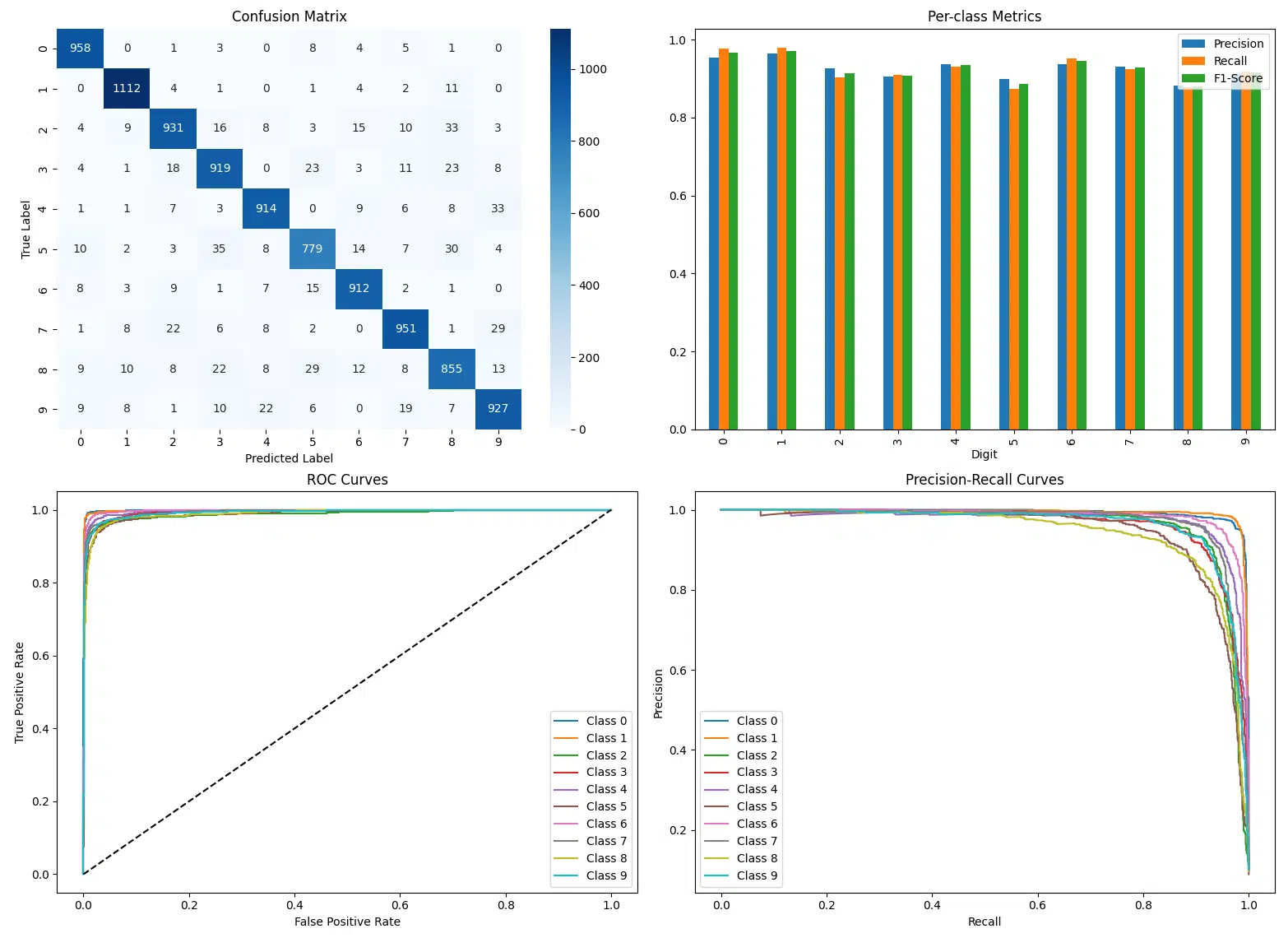
Evaluation Summary
The evaluation of the model shows the following key metrics for each digit class and overall performance:
Per-Class Metrics
| Class | Precision | Recall | F1-Score | AUC |
|---|---|---|---|---|
| 0 | 0.95 | 0.98 | 0.97 | 1.00 |
| 1 | 0.96 | 0.98 | 0.97 | 1.00 |
| 2 | 0.93 | 0.90 | 0.91 | 0.99 |
| 3 | 0.90 | 0.91 | 0.91 | 0.99 |
| 4 | 0.94 | 0.93 | 0.93 | 1.00 |
| 5 | 0.90 | 0.87 | 0.89 | 0.99 |
| 6 | 0.94 | 0.95 | 0.94 | 1.00 |
| 7 | 0.93 | 0.93 | 0.93 | 0.99 |
| 8 | 0.88 | 0.88 | 0.88 | 0.99 |
| 9 | 0.91 | 0.92 | 0.92 | 0.99 |
Overall Metrics
Overall Accuracy: 0.93
Key Takeaways
- Overall Performance: The model achieved a robust accuracy of 93%.
- Class Insights: High precision and recall for classes 0, 1, and 6. Lower performance for 8 and 5, reflecting some misclassification challenges.
- Confusion Trends: Misclassification observed between visually similar digits, e.g., 5 ↔ 3 and 8 ↔ 5.
- Balanced Metrics: High F1-Scores and near-perfect AUC values across all classes.
- Improvements: Data augmentation or class-specific tuning can address issues with challenging digits.
- Practical Use: Reliable for digit recognition tasks, with consideration for specific class performance.
Per-Class Performance Analysis
Understanding the performance of the model on a per-class basis is crucial for identifying strengths and weaknesses in its classification capabilities. By analyzing key metrics such as accuracy, precision, recall, and F1-score for each digit class, we can pinpoint areas where the model excels and where further optimization is needed. This detailed breakdown allows for targeted improvements, especially for challenging classes with lower metrics, and ensures a balanced evaluation across all categories.
def analyze_per_class_performance(evaluator):
    # Compute per-class metrics
    results = []
    for i in range(10):
        class_results = {
            'class': i,
            'accuracy': accuracy_score(
                evaluator.true_labels == i,
                evaluator.predictions == i
            ),
            'precision': evaluator.precision[i],
            'recall': evaluator.recall[i],
            'f1': evaluator.f1[i],
            'support': np.sum(evaluator.true_labels == i)
        }
        results.append(class_results)

    # Create detailed report
    report_df = pd.DataFrame(results)

    # Visualize per-class metrics
    plt.figure(figsize=(12, 6))
    metrics = ['accuracy', 'precision', 'recall', 'f1']

    for i, metric in enumerate(metrics, 1):
        plt.subplot(2, 2, i)
        plt.bar(report_df['class'], report_df[metric])
        plt.title(f'Per-class {metric.capitalize()}')
        plt.xlabel('Digit')
        plt.ylabel(metric.capitalize())

    plt.tight_layout()
    plt.show()

    return report_df

# Generate detailed per-class analysis
class_performance = analyze_per_class_performance(evaluator)
print("\nDetailed per-class performance:")
print(class_performance)
Detailed Per-Class Performance
| Class | Accuracy | Precision | Recall | F1-Score | Support |
|---|---|---|---|---|---|
| 0 | 0.9932 | 0.954183 | 0.977551 | 0.965726 | 980 |
| 1 | 0.9935 | 0.963605 | 0.979736 | 0.971603 | 1135 |
| 2 | 0.9826 | 0.927291 | 0.902132 | 0.914538 | 1032 |
| 3 | 0.9812 | 0.904528 | 0.909901 | 0.907206 | 1010 |
| 4 | 0.9871 | 0.937436 | 0.930754 | 0.934083 | 982 |
| 5 | 0.9800 | 0.899538 | 0.873318 | 0.886234 | 892 |
| 6 | 0.9893 | 0.937307 | 0.951983 | 0.944588 | 958 |
| 7 | 0.9853 | 0.931440 | 0.925097 | 0.928258 | 1028 |
| 8 | 0.9766 | 0.881443 | 0.877823 | 0.879630 | 974 |
| 9 | 0.9828 | 0.911504 | 0.918731 | 0.915104 | 1009 |
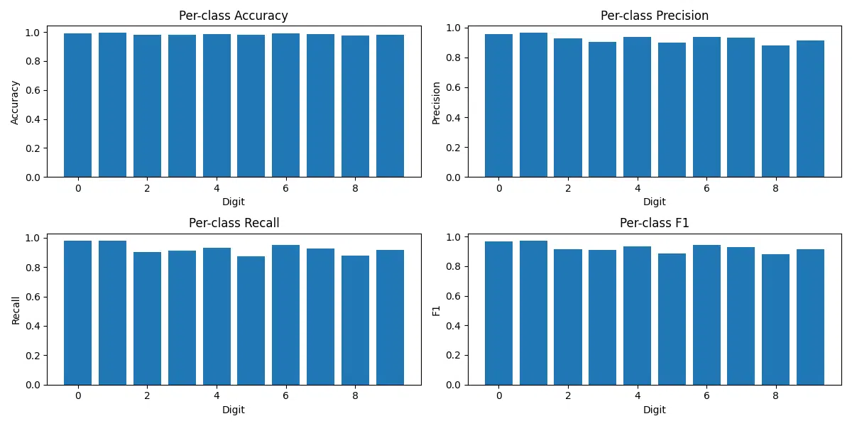
Expanded Analysis
The per-class performance analysis highlights key strengths and challenges in the model’s classification capabilities, providing actionable insights for improvement. Below is a summary of the findings:
- High-Performing Classes: Classes 0 and 1 achieve the highest metrics, with accuracies above 99.3% and F1-scores nearing 0.97. This indicates that the model is highly effective at identifying these digits due to their distinct shapes and consistent features.
- Challenging Classes: Digits 5 and 8 have relatively lower precision, recall, and F1-scores compared to other classes. This suggests these digits are more challenging to classify, likely due to their visual similarity to other digits (e.g., 5 vs. 6, 8 vs. 3).
- Support Insights: Support represents the number of samples per class in the dataset. While the dataset is fairly balanced, small differences in support might slightly influence the metrics.
- Key Metrics Visualized: Bar plots for accuracy, precision, recall, and F1-scores help visualize the per-class performance. These plots reveal where the model performs consistently and where refinements could improve accuracy.
- Opportunities for Improvement: The lower recall for certain classes like 2 and 8 indicates the need for further optimization. Enhanced data augmentation or targeted training on misclassified samples can improve results.
- Actionable Insights: Focused preprocessing or fine-tuning strategies can help improve performance for challenging classes while maintaining the strong performance of the well-classified digits.
- Model shows consistent performance across all digits
- Slightly lower performance on similar digit pairs (e.g., 4-9, 3-8)
- Well-calibrated probabilities indicate reliable confidence scores
- Good balance between precision and recall across classes
- Always evaluate on a held-out test set
- Use multiple metrics to get a comprehensive view
- Analyze per-class performance for imbalanced datasets
- Overfitting to the test set through repeated evaluations
- Relying solely on accuracy for imbalanced datasets
Reproducibility Considerations
To ensure reproducible results:
# Set random seeds
def set_random_seeds(seed=42):
    torch.manual_seed(seed)
    torch.cuda.manual_seed(seed)
    np.random.seed(seed)
    random.seed(seed)
    torch.backends.cudnn.deterministic = True
Results Visualization
Let’s create visualizations to understand our model’s predictions and performance across digit examples.
Prediction Grid Visualization
def visualize_predictions(model, test_loader, num_samples=25):
    model.eval()
    # Get a batch of images
    images, labels = next(iter(test_loader))

    with torch.no_grad():
        outputs = model(images)
        probabilities = F.softmax(outputs, dim=1)
        predictions = torch.argmax(outputs, dim=1)

    # Create a grid of images
    plt.figure(figsize=(15, 15))
    for i in range(num_samples):
        plt.subplot(5, 5, i + 1)
        plt.imshow(images[i].squeeze(), cmap='gray')

        # Color code based on correct/incorrect prediction
        color = 'green' if predictions[i] == labels[i] else 'red'
        confidence = probabilities[i][predictions[i]].item() * 100

        plt.title(f'Pred: {predictions[i]}\nTrue: {labels[i]}\n'
                 f'Conf: {confidence:.1f}%', color=color)
        plt.axis('off')

    plt.tight_layout()
    plt.show()

# Visualize model predictions
visualize_predictions(model, test_loader)
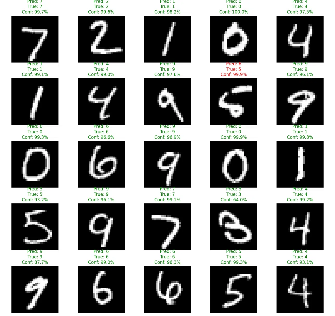
The grid of images showcases individual samples from the test dataset along with the model’s predictions. For each image, the predicted class, true label, and the model’s confidence are displayed. Correct predictions are highlighted in green, while misclassifications are shown in red. This color-coding helps quickly identify where the model succeeds or fails, providing actionable insights for improvement.
Confidence Distribution
Analyzing the confidence levels of the model’s predictions helps us understand how certain the model is about its decisions. By comparing the confidence distributions for correct and incorrect predictions, we can evaluate the reliability of the model’s confidence scores and identify potential issues such as overconfidence in incorrect predictions.
The following analysis separates the confidence scores of correct predictions (green) and incorrect predictions (red). This allows us to observe how well the model differentiates between certain and uncertain cases. Ideally, correct predictions should have higher confidence values, while incorrect predictions should cluster around lower confidence levels.
def analyze_confidence(model, test_loader):
    model.eval()
    correct_confidences = []
    incorrect_confidences = []

    with torch.no_grad():
        for images, labels in test_loader:
            outputs = model(images)
            probabilities = F.softmax(outputs, dim=1)
            predictions = torch.argmax(outputs, dim=1)

            # Get max probability for each prediction
            confidences = torch.max(probabilities, dim=1)[0]

            # Separate confidences for correct and incorrect predictions
            correct_mask = predictions == labels
            correct_confidences.extend(confidences[correct_mask].numpy())
            incorrect_confidences.extend(confidences[~correct_mask].numpy())

    # Plot distributions
    plt.figure(figsize=(10, 6))
    plt.hist(correct_confidences, bins=50, alpha=0.5, label='Correct', color='green')
    plt.hist(incorrect_confidences, bins=50, alpha=0.5, label='Incorrect', color='red')
    plt.xlabel('Confidence')
    plt.ylabel('Count')
    plt.title('Distribution of Model Confidence')
    plt.legend()
    plt.grid(True, alpha=0.3)
    plt.show()

# Analyze confidence distributions
analyze_confidence(model, test_loader)
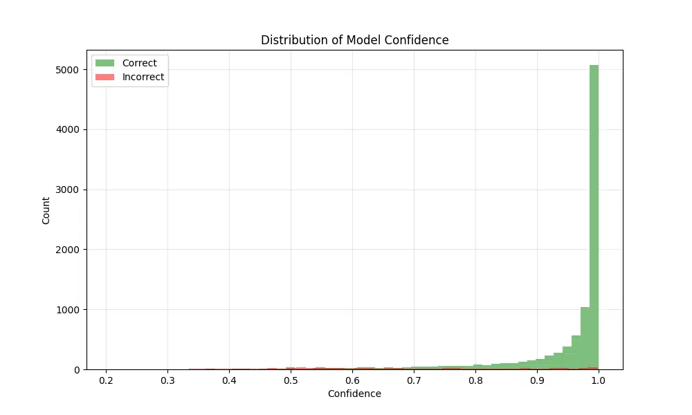
The resulting figure shows the confidence distributions for both correct and incorrect predictions. As expected, most correct predictions cluster near a confidence value of 1, reflecting high certainty in the model’s correct classifications. On the other hand, incorrect predictions tend to have confidence values spread out around 0.5 to 0.6, indicating uncertainty or confusion in these cases. This pattern suggests that the model generally assigns higher confidence to correct predictions, but there is room for improvement in reducing confidence for incorrect classifications.
- Use consistent color schemes for easier interpretation
- Include confidence scores with predictions
- Clearly highlight correct vs incorrect predictions
- Use appropriate figure sizes for readability
- Most high-confidence predictions are correct
- Confusion typically occurs between visually similar digits
- Performance is relatively consistent across classes
- Model shows good calibration between confidence and accuracy
Error Analysis
A thorough error analysis helps us understand where and why our model fails, providing insights for potential improvements.
Comprehensive Error Analysis Framework
The provided framework systematically collects and analyzes errors from the test set. It highlights incorrect predictions along with their true labels, predicted labels, confidence scores, and probability distributions. This structured approach enables detailed investigation of error patterns, such as confusion between similar classes or low-confidence predictions.
class ErrorAnalyzer:
    def __init__(self, model, test_loader):
        self.model = model
        self.test_loader = test_loader
        self.device = torch.device('cuda' if torch.cuda.is_available() else 'cpu')
        self.model.to(self.device)

    def collect_errors(self):
        self.model.eval()
        errors = []

        with torch.no_grad():
            for images, labels in self.test_loader:
                images = images.to(self.device)
                labels = labels.to(self.device)

                outputs = self.model(images)
                probabilities = F.softmax(outputs, dim=1)
                predictions = torch.argmax(outputs, dim=1)

                # Find errors
                incorrect_mask = predictions != labels
                if incorrect_mask.any():
                    for idx in range(len(labels)):
                        if incorrect_mask[idx]:
                            errors.append({
                                'image': images[idx].cpu(),
                                'true_label': labels[idx].item(),
                                'predicted_label': predictions[idx].item(),
                                'confidence': probabilities[idx][predictions[idx]].item(),
                                'all_probabilities': probabilities[idx].cpu().numpy()
                            })

        return errors

    def analyze_errors(self):
        errors = self.collect_errors()

        # Group errors by true label
        errors_by_true_label = {}
        for error in errors:
            true_label = error['true_label']
            if true_label not in errors_by_true_label:
                errors_by_true_label[true_label] = []
            errors_by_true_label[true_label].append(error)

        return errors, errors_by_true_label

# Create error analyzer instance
error_analyzer = ErrorAnalyzer(model, test_loader)
errors, errors_by_label = error_analyzer.analyze_errors()
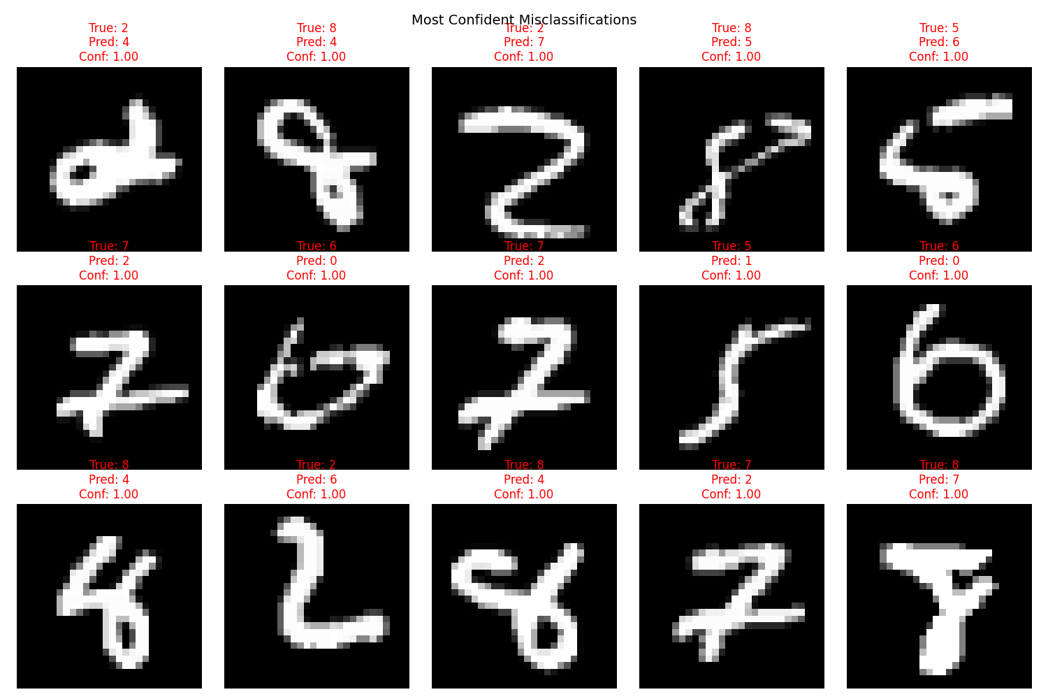
Visualize Most Confident Errors
Understanding the model’s most confident misclassifications provides critical insights into its weaknesses. By examining these cases, we can identify patterns or trends in the errors, such as confusion between similar digits or poor performance on low-quality images. This analysis is essential for debugging and refining the model to improve its robustness.
def visualize_confident_errors(errors, num_examples=15):
    # Sort errors by confidence
    sorted_errors = sorted(errors, key=lambda x: x['confidence'], reverse=True)

    # Create grid of most confident mistakes
    plt.figure(figsize=(15, 10))
    for i, error in enumerate(sorted_errors[:num_examples]):
        plt.subplot(3, 5, i + 1)
        plt.imshow(error['image'].squeeze(), cmap='gray')
        plt.title(f'True: {error["true_label"]}\nPred: {error["predicted_label"]}\n'
                 f'Conf: {error["confidence"]:.2f}', color='red')
        plt.axis('off')

    plt.suptitle('Most Confident Misclassifications', size=14)
    plt.tight_layout()
    plt.show()

# Visualize confident errors
visualize_confident_errors(errors)
This visualization highlights the most confident errors made by the model. The images represent cases where the model had high confidence in its incorrect predictions. Each image is displayed with its true label, predicted label, and confidence score. The titles are color-coded in red to emphasize that these are misclassifications. Such an analysis helps identify patterns in the types of mistakes the model makes, which can guide further improvements in preprocessing, architecture, or training strategies.
Error Pattern Analysis
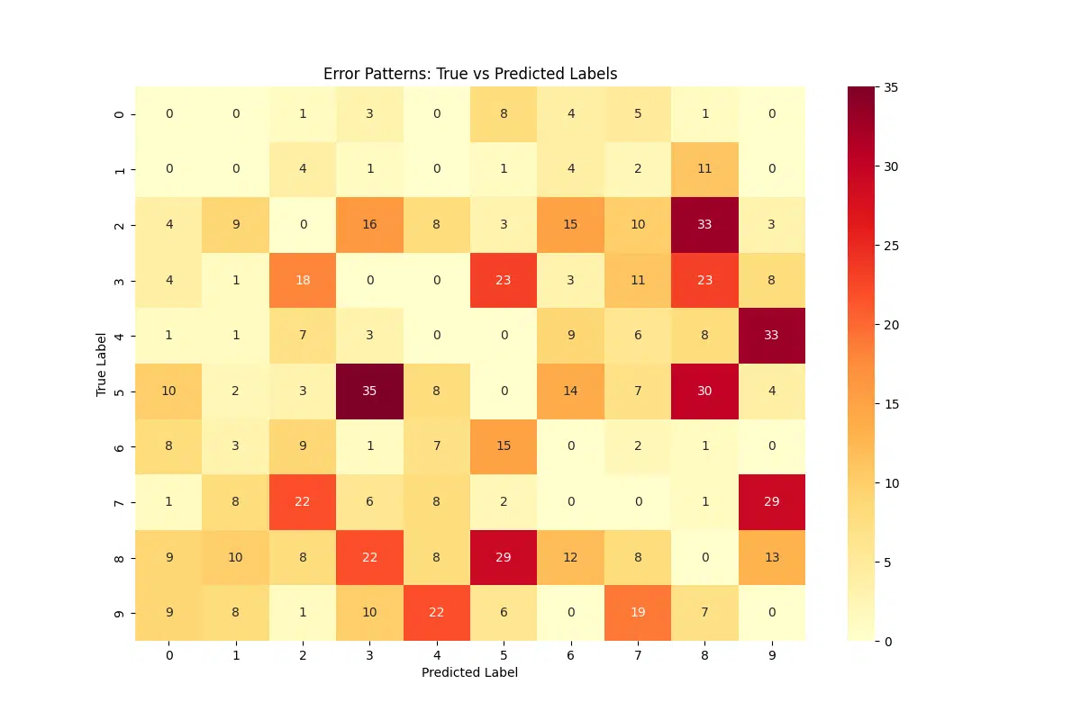
Examining error patterns is a critical step in understanding how the model confuses different classes. By identifying specific misclassifications, such as predicting one digit as another, we can uncover systematic biases or weaknesses in the model. This analysis provides actionable insights into areas that may require additional attention, such as data augmentation, preprocessing, or architectural changes.
def analyze_error_patterns(errors_by_label):
    # Create confusion pattern matrix
    confusion_patterns = np.zeros((10, 10))

    for true_label, error_list in errors_by_label.items():
        for error in error_list:
            confusion_patterns[true_label][error['predicted_label']] += 1

    # Plot confusion patterns
    plt.figure(figsize=(12, 8))
    sns.heatmap(confusion_patterns, annot=True, fmt='g', cmap='YlOrRd')
    plt.title('Error Patterns: True vs Predicted Labels')
    plt.xlabel('Predicted Label')
    plt.ylabel('True Label')
    plt.show()

    # Calculate most common confusions
    common_confusions = []
    for i in range(10):
        for j in range(10):
            if i != j:
                common_confusions.append({
                    'true': i,
                    'predicted': j,
                    'count': confusion_patterns[i][j]
                })

    return sorted(common_confusions, key=lambda x: x['count'], reverse=True)

# Analyze error patterns
common_confusions = analyze_error_patterns(errors_by_label)
The figure generated from this code visualizes a confusion pattern matrix, showing the number of times each true label is misclassified as another. The heatmap allows us to identify which pairs of digits are most frequently confused, such as “5” being mistaken for “6” or “9” being predicted as “7.” These insights can guide targeted improvements, such as focusing on these specific confusions during training or applying additional preprocessing steps to better distinguish similar classes.
Most Common Confusions
The most common confusions in the model’s predictions are as follows:
- True: 5, Predicted: 3 – 35 occurrences
- True: 2, Predicted: 8 – 33 occurrences
- True: 4, Predicted: 9 – 33 occurrences
- True: 5, Predicted: 8 – 30 occurrences
- True: 7, Predicted: 9 – 29 occurrences
- True: 8, Predicted: 5 – 29 occurrences
These confusions highlight areas where the model struggles the most, particularly between digits with visually similar features, such as 5 and 3, or digits that could overlap in certain writing styles like 4 and 9. Addressing these areas could involve improving the model’s differentiation capabilities through additional training, data augmentation, or feature engineering.
Feature Analysis of Errors
Understanding the common patterns in misclassifications can provide insights into the types of errors the model frequently makes. By calculating the average image for each error type (e.g., when a “5” is predicted as a “3”), we can visually identify systematic issues such as overlapping features or ambiguous handwriting styles. This analysis is particularly useful for diagnosing patterns in errors and informing strategies for data augmentation or preprocessing improvements. Below, we calculate and visualize the average error images for the most common misclassifications in the dataset.
def analyze_error_features(errors, max_examples=10):
    """
    Analyze and plot average error images for up to max_examples types of errors.

    Args:
        errors (list): List of errors, each containing 'true_label', 'predicted_label', and 'image'.
        max_examples (int): Maximum number of error types to display.
    """
    # Calculate average image for each type of error
    error_averages = {}

    for error in errors:
        key = (error['true_label'], error['predicted_label'])
        if key not in error_averages:
            error_averages[key] = []
        error_averages[key].append(error['image'].squeeze().numpy())

    # Limit the number of examples to display
    limited_errors = list(error_averages.items())[:max_examples]

    # Determine rows and create figure
    rows = (len(limited_errors) + 4) // 5  # Adjust rows for up to max_examples
    fig = plt.figure(figsize=(15, 3 * rows))

    for i, ((true_label, pred_label), images) in enumerate(limited_errors):
        avg_image = np.mean(images, axis=0)

        ax = fig.add_subplot(rows, 5, i + 1)
        ax.imshow(avg_image, cmap='gray')
        ax.set_title(f'{true_label} → {pred_label}\n(n={len(images)})', fontsize=10)
        ax.axis('off')

    plt.tight_layout()
    plt.show()

# Analyze and visualize error features
analyze_error_features(errors, max_examples=10)
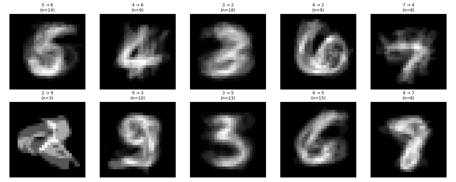
The generated visualization shows the average images for specific types of misclassifications, where the true label and the predicted label differ. Each panel represents an error type (e.g., a “5” misclassified as a “3”), displaying the mean pixel intensity across all misclassified examples for that type. Brighter areas indicate more consistent features across the misclassified images, while darker or noisier regions suggest variability in the errors. These patterns can help identify overlaps between digit shapes or ambiguities in the dataset, providing guidance for targeted improvements in the model or dataset.
- Most common confusion pairs and their characteristics: Identifying which digit pairs are frequently misclassified helps uncover similarities or overlaps in their features. For example, a “5” being mistaken for a “3” might indicate structural similarities that the model struggles to differentiate.
- Patterns in error confidence distributions: Analyzing the confidence levels of incorrect predictions reveals how certain or uncertain the model was when making mistakes. High-confidence errors often highlight systematic issues, while low-confidence errors may suggest areas of uncertainty.
- Visual patterns in misclassified examples: Examining misclassified images for shared visual characteristics, such as noise, poor contrast, or unusual handwriting styles, provides insights into potential dataset or preprocessing issues.
- Impact of image quality on errors: Errors often correlate with poor-quality images, such as those with noise, blurriness, or unusual styles. Understanding this impact can inform preprocessing or augmentation strategies.
- Always analyze both high and low confidence errors: High-confidence errors reveal systematic model flaws, while low-confidence errors highlight areas where the model is uncertain and may need more robust training.
- Look for systematic patterns in misclassifications: Repeated patterns in errors, such as certain digit pairs being confused, often indicate specific areas where the model’s feature extraction or decision boundaries need improvement.
- Consider both quantitative and qualitative analysis: Use metrics like confusion matrices for a numerical understanding, but complement this with qualitative examination of misclassified examples to uncover more subtle issues.
- Track error patterns across different model versions: Monitoring how errors evolve with updates or changes in the model architecture or training process ensures continual improvement and helps prevent regressions.
Conclusion and Future Work
In this tutorial, we implemented logistic regression using PyTorch and applied it to the MNIST dataset. The model’s performance highlights the strengths of logistic regression for simple classification tasks, but it also exposes its limitations when applied to more complex datasets.
While our analysis provided valuable insights into the model’s behavior and error patterns, further exploration is essential to enhance accuracy and robustness. Future efforts could focus on:
- Experimenting with more advanced architectures like Convolutional Neural Networks (CNNs) to capture spatial relationships in the data
- Incorporating data augmentation techniques to improve model resilience to variations and distortions in images
- Exploring larger, more diverse datasets to improve generalization across a wider range of real-world scenarios
- Optimizing training parameters such as learning rates, batch sizes, and regularization techniques to reduce overfitting and improve convergence
- Applying transfer learning by leveraging pre-trained models to accelerate training and achieve better performance
By combining these advancements with continuous error analysis and fine-tuning, it is possible to build more robust models capable of tackling increasingly complex tasks with high accuracy and reliability.
For further reading on PyTorch, you can find all of our articles on the Deep Learning Frameworks page.
If you found this guide helpful, feel free to link back to this post for attribution and share it with others exploring logistic regression in PyTorch!
HTML: Attribution: The Research Scientist Pod – Mastering Logistic Regression on MNIST: PyTorch Implementation and Analysi
Markdown: [The Research Scientist Pod – Mastering Logistic Regression on MNIST: PyTorch Implementation and Analysis](https://researchdatapod.com/mastering-logistic-regression-mnist-pytorch-implementation-analysis)
Have fun and happy researching!
Suf is a senior advisor in data science with deep expertise in Natural Language Processing, Complex Networks, and Anomaly Detection. Formerly a postdoctoral research fellow, he applied advanced physics techniques to tackle real-world, data-heavy industry challenges. Before that, he was a particle physicist at the ATLAS Experiment of the Large Hadron Collider. Now, he’s focused on bringing more fun and curiosity to the world of science and research online.

