Table of Contents
Introduction
Quadratic regression is a powerful statistical technique for modeling curved relationships between variables. In R, we have several robust methods to implement this type of regression, from base R functions to specialized packages that provide enhanced visualization and diagnostics.
This guide will walk you through implementing quadratic regression in R, covering everything from basic implementation to advanced diagnostics and visualization techniques. We’ll explore how to use both base R functions and popular packages like ggplot2 for creating professional visualizations of your regression analysis.
Mathematical Foundations
Quadratic regression models the relationship between an independent variable (\(x\)) and a dependent variable (\(y\)) using a second-degree polynomial equation. The model can be written as:
\[ y = \beta_0 + \beta_1x + \beta_2x^2 + \epsilon \]
Each term in this equation has a specific meaning:
- \( y \): The dependent variable, or the outcome we aim to predict.
- \( x \): The independent variable, or the input used to make predictions.
- \( \beta_0 \): The intercept, representing the value of \(y\) when \(x = 0\).
- \( \beta_1 \): The linear coefficient, quantifying the linear relationship between \(x\) and \(y\).
- \( \beta_2 \): The quadratic coefficient, capturing the curvature of the relationship.
- \( \epsilon \): The error term, accounting for variability in \(y\) not explained by the model.
The quadratic term (\( \beta_2x^2 \)) is what distinguishes this model from simple linear regression. It allows the curve to bend, making quadratic regression ideal for datasets where the relationship between variables is non-linear, such as U-shaped or inverted U-shaped patterns.
For example, in economics, quadratic regression can model diminishing returns, where the benefit of adding more input decreases over time. In physics, it can represent projectile motion, where the height of an object depends on time in a parabolic trajectory.
With a solid understanding of the mathematical structure, we’re ready to move on to implementing quadratic regression in Python.
Using Base R
Let’s start with implementing quadratic regression using base R functions. We’ll generate sample data, fit a quadratic model, and visualize the results. This step-by-step approach ensures you understand both the implementation and the interpretation of the output.
Code Walkthrough
The following code demonstrates how to implement quadratic regression in R. Each step is explained to help you grasp the underlying process:
# Step 1: Generate sample data
set.seed(123) # Ensures reproducibility
x <- seq(-5, 5, length.out = 100) # Creates 100 evenly spaced values from -5 to 5
y <- 2*x^2 - 3*x + 1 + rnorm(100, mean = 0, sd = 2) # Quadratic relationship with noise

# Step 2: Create a data frame for analysis
data <- data.frame(x = x, y = y)

# Step 3: Fit the quadratic model
model <- lm(y ~ x + I(x^2), data = data)

# Step 4: View the model summary
summary(model)

# Step 5: Visualize the data and fitted model
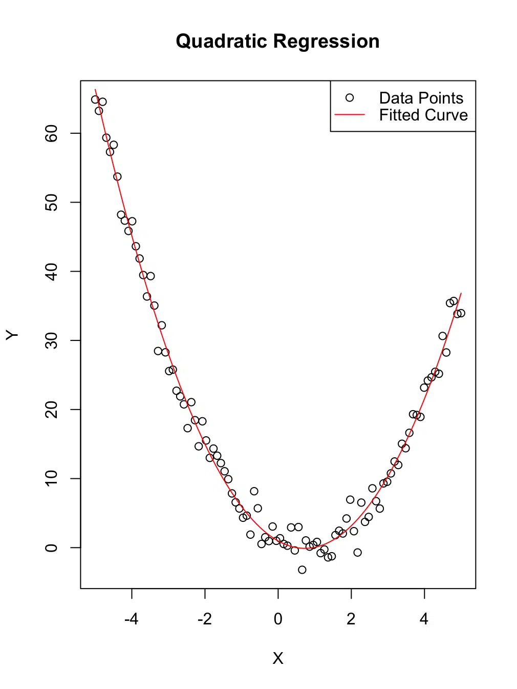
plot(x, y, main = "Quadratic Regression", xlab = "X", ylab = "Y")
curve(predict(model, newdata = data.frame(x = x)), add = TRUE, col = "red")

# Step 6: Add a legend for clarity
legend("topright", legend = c("Data Points", "Fitted Curve"),
       col = c("black", "red"), pch = c(1, NA), lty = c(NA, 1))
Explanation
- Data Generation: We simulate data using a known quadratic relationship. The term
rnorm()adds random noise to make the data more realistic. - Quadratic Model: The
lm()function is used to fit a quadratic regression model. The termI(x^2)ensures the quadratic term is treated as a distinct predictor. - Visualization: The
plot()function creates a scatter plot, andcurve()overlays the fitted regression curve. A legend is added for clarity.
Model Summary and Results
Call:
lm(formula = y ~ x + I(x^2), data = data)

Residuals:
    Min      1Q  Median      3Q     Max
-4.8136 -1.1977 -0.0533  1.3549  4.3891

Coefficients:
            Estimate Std. Error t value Pr(>|t|)
(Intercept)  0.97077    0.27431   3.539 0.000618 ***
x           -2.95028    0.06271 -47.044  < 2e-16 ***
I(x^2)       2.02471    0.02405  84.186  < 2e-16 ***
---
Signif. codes:  0 ‘***’ 0.001 ‘**’ 0.01 ‘*’ 0.05 ‘.’ 0.1 ‘ ’ 1

Residual standard error: 1.829 on 97 degrees of freedom
Multiple R-squared:  0.9897,	Adjusted R-squared:  0.9895
F-statistic:  4650 on 2 and 97 DF,  p-value: < 2.2e-16
Analysis
The model summary provides valuable insights into the regression analysis:
- Coefficients: The estimates for the quadratic term (
I(x^2)), linear term (x), and intercept are highly significant, as indicated by theirp-values. - Goodness-of-Fit: The
Multiple R-squaredvalue of 0.9897 suggests that the model explains approximately 99% of the variance in the data. This indicates an excellent fit. - Residual Standard Error: The standard error of 1.829 indicates the average deviation of the observed values from the fitted values.
Overall, the model captures the quadratic relationship effectively, as reflected in the high significance of the coefficients and the high R-squared value.

x) and the dependent variable (y).
Visualization with ggplot2
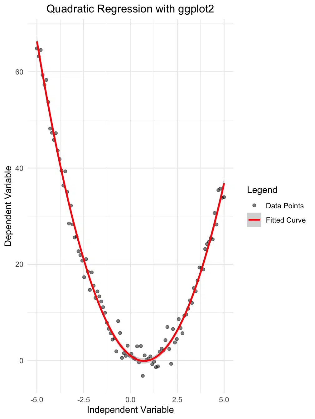
While base R plotting is functional, ggplot2 offers more aesthetic and customizable visualizations. Here, we'll create a scatter plot with a fitted quadratic regression line and confidence interval, adding a legend for clarity:
library(ggplot2)

# Create the plot
ggplot(data, aes(x = x, y = y)) +
  geom_point(aes(color = "Data Points"), alpha = 0.5) + # Add points with a label for legend
  geom_smooth(aes(color = "Fitted Curve"),
              method = "lm",
              formula = y ~ x + I(x^2),
              se = TRUE) + # Add confidence interval
  scale_color_manual(name = "Legend", # Define legend title and labels
                     values = c("Data Points" = "black", "Fitted Curve" = "red")) +
  theme_minimal() +
  labs(title = "Quadratic Regression with ggplot2",
       x = "Independent Variable",
       y = "Dependent Variable") +
  theme(plot.title = element_text(hjust = 0.5))
Interpreting the Plot
The plot above offers several important insights:
- Data Points: The black dots represent the observed data, showcasing the distribution of the independent variable (
x) and the dependent variable (y). - Fitted Curve: The red parabolic curve represents the quadratic regression line. This curve captures the non-linear relationship between the variables.
- Confidence Interval: The shaded region around the red curve illustrates the 95% confidence interval, providing a range within which the true regression line is likely to fall.
- Legend: The legend helps distinguish the data points and the fitted curve, improving the plot's interpretability.
This enhanced visualization highlights the power of ggplot2 for creating professional-quality plots. The fitted curve aligns well with the data points, indicating that the quadratic model captures the underlying relationship effectively. The confidence interval adds another layer of insight, showing areas of higher or lower uncertainty in the model's predictions.
Model Diagnostics
Proper model diagnostics are crucial to ensure that your regression model is reliable and satisfies key assumptions. In R, we can use a combination of diagnostic plots and statistical tests to evaluate the performance of our quadratic regression model.
Diagnostic Tests
# Generate diagnostic plots
par(mfrow = c(2, 2)) # Arrange plots in a 2x2 grid
plot(model)

# Additional diagnostic tests
library(car)

# Test for normality of residuals
shapiro.test(residuals(model))

# Test for heteroscedasticity (non-constant variance)
ncvTest(model)

# Calculate Variance Inflation Factor (VIF)
vif(model)
What the Tests Do
These diagnostic tests help evaluate whether our quadratic regression model meets some key assumptions for reliable predictions. Here’s what each test does:
-
Shapiro-Wilk Test:
This test checks whether the residuals (the differences between the actual and predicted values) are normally distributed.
- Why it’s important: Many statistical methods assume that the residuals are normally distributed because this ensures accurate predictions and valid hypothesis testing.
- How it works: If the p-value is high (e.g., 0.9935 in this case), it means the residuals are close to normal, and there’s no evidence of a problem with this assumption.
- In simple terms: Think of this as a check to see if the errors in your model behave like they’re randomly scattered, which is what we want.
-
Non-Constant Variance Test (Breusch-Pagan Test):
This test looks for heteroscedasticity, which is when the variability of the residuals changes across the range of fitted values.
- Why it’s important: Constant variance (homoscedasticity) ensures that the model predicts equally well across all values of the independent variable.
- How it works: If the p-value is high (e.g., 0.74902), it means the variance is constant, and there’s no evidence of heteroscedasticity.
- In simple terms: This test checks if the "spread" of the errors stays the same no matter what the predictions are. If not, the model might not be reliable for all data ranges.
-
Variance Inflation Factor (VIF):
This test detects multicollinearity, which happens when predictors in the model are highly correlated with each other.
- Why it’s important: Multicollinearity makes it hard to determine the individual effect of each predictor, and it can distort the model’s coefficients.
- How it works: VIF values close to 1 indicate no multicollinearity, which is ideal. Higher values (e.g., above 5 or 10) suggest potential problems.
- In simple terms: This test checks if your predictors are "stepping on each other’s toes" by overlapping too much in the information they provide.
Interpreting the Results
Based on the results:
- The residuals are normally distributed (Shapiro-Wilk p-value = 0.9935).
- There is no evidence of heteroscedasticity (p-value = 0.74902), indicating constant variance of residuals.
- The VIF values for both predictors (
xandI(x^2)) are 1, confirming no multicollinearity.
Diagnostic Plots
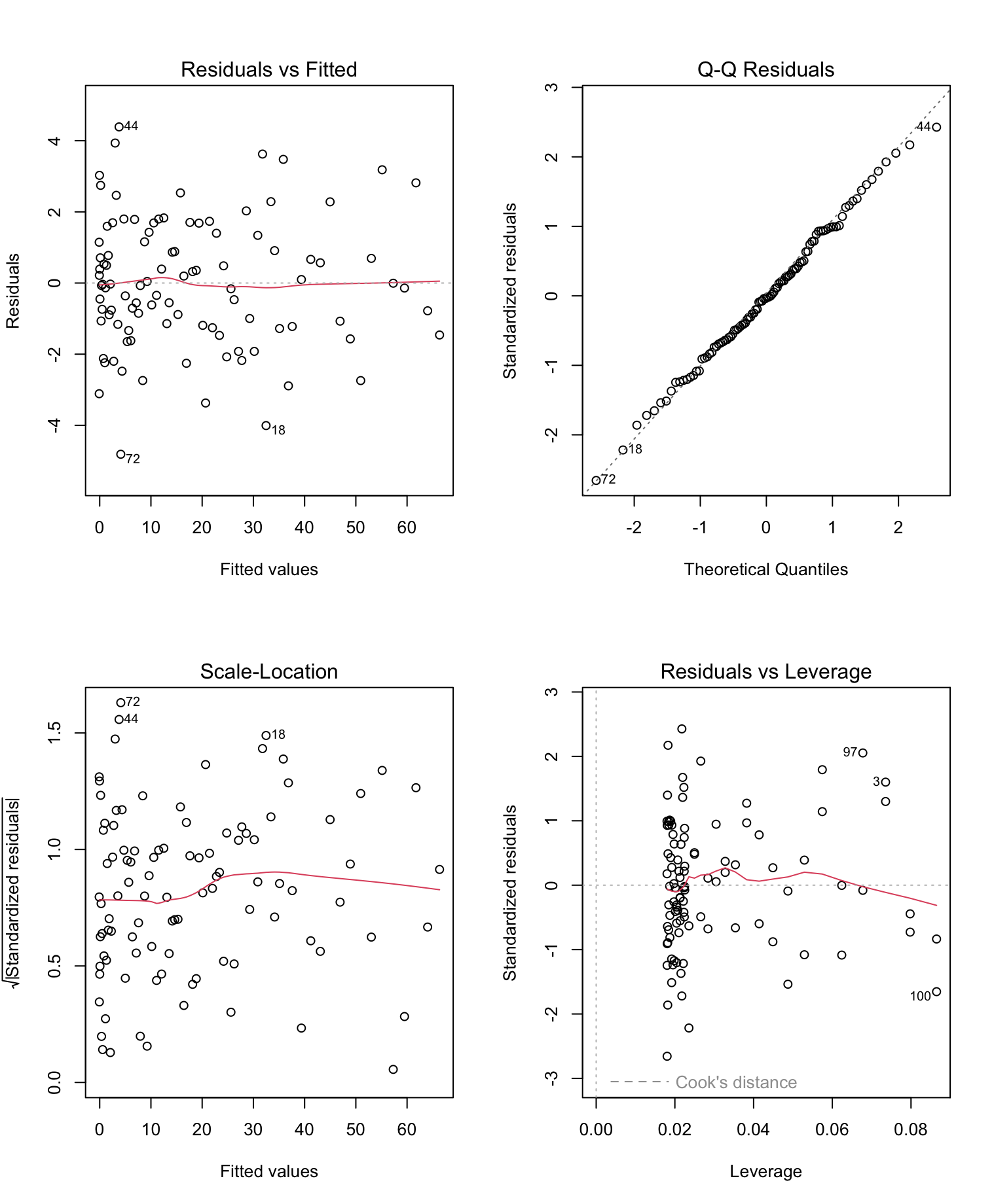
The diagnostic plots generated by plot(model) provide a visual assessment of model assumptions:
- Residuals vs Fitted: This plot checks for non-linearity and heteroscedasticity. The residuals should appear randomly scattered around zero without any clear pattern. Patterns may indicate issues with model fit or non-linearity.
- Normal Q-Q Plot: This plot assesses whether residuals follow a normal distribution. Points should align closely with the diagonal reference line. Deviations indicate non-normality.
- Scale-Location Plot: Also known as the spread-location plot, it checks for homoscedasticity (constant variance). The residuals should appear equally spread along the fitted values.
- Residuals vs Leverage: This plot identifies influential observations that could unduly affect the model. Points with high leverage and large residuals (Cook's distance) require further investigation.

Summary
The diagnostic tests and plots confirm that our quadratic regression model satisfies key assumptions, including normality of residuals, homoscedasticity, and absence of multicollinearity. These results indicate that the model is reliable for interpreting the relationship between the variables.
Best Practices
Tips for Effective Implementation:
- Data Preparation: Always check for missing values and outliers before fitting the model.
- Model Validation: Use cross-validation to assess model performance on unseen data.
- Visualization: Create diagnostic plots to check model assumptions.
- Documentation: Keep clear records of model specifications and assumptions.
Common Pitfalls to Avoid:
- Overfitting: Don't automatically assume a quadratic model is appropriate.
- Extrapolation: Be cautious when predicting outside the range of your data.
- Multicollinearity: Check for high correlation between predictors.
- Assumption Violations: Verify that model assumptions are met.
Conclusion
R provides a robust and versatile environment for implementing quadratic regression, ranging from basic model fitting to advanced diagnostics and visualization. The combination of base R functions with specialized packages like ggplot2 for visualization and car for diagnostics enables you to conduct comprehensive analyses that not only fit your data but also provide actionable insights into model performance and reliability.
Model diagnostics play a critical role in ensuring the validity of your regression results. By using diagnostic plots and statistical tests, you can identify issues such as non-linearity, heteroscedasticity, and influential data points, ensuring your model meets the necessary assumptions. Tools like the Shapiro-Wilk test for normality, Breusch-Pagan test for constant variance, and Variance Inflation Factor (VIF) for multicollinearity provide valuable insights for refining your model.
It is equally important to consider the broader context of your data and research questions when interpreting regression results. Quadratic regression is particularly useful for capturing non-linear relationships, making it a valuable addition to your R analysis toolkit when applied correctly.
To deepen your understanding, we recommend exploring the resources listed in the Further Reading section, which offers additional tutorials, tools, and theoretical insights into regression analysis and visualization in R. For those who wish to cite or link back to this guide, visit the Attribution and Citation section for ready-to-use citation formats and linking options.
Have fun and happy coding!
Further Reading
Expand your knowledge with these additional resources on R programming, regression analysis, and model diagnostics.
-
Quadratic Regression in Python
A detailed guide to implementing quadratic regression in Python using NumPy, Scikit-learn, and Statsmodels, with visualizations and examples.
-
Quadratic Regression Calculator
Interactive tool to perform quadratic regression analysis with step-by-step guidance and visualization. Ideal for exploring relationships in your data efficiently.
-
ggplot2 Documentation
Official ggplot2 documentation for creating customizable, aesthetic visualizations in R, including regression plots.
-
CAR Package for R
Comprehensive resources on using the CAR package for regression diagnostics and statistical tests.
-
R Documentation: lm()
Official documentation for the
lm()function, detailing linear and polynomial regression in R. -
Broom Package for R
Learn how to tidy and summarize model outputs in R using the broom package, making it easier to interpret regression results.
-
Data Manipulation with dplyr
Master the dplyr package for efficient data preparation and manipulation before performing regression analysis.
-
Polynomial Regression Theory
Theoretical background on polynomial regression, including mathematical foundations and applications.
-
Regression Diagnostics
Learn about methods for assessing regression model assumptions and identifying potential issues.
Attribution and Citation
If you found this guide and tools helpful, feel free to link back to this page or cite it in your work!
Suf is a senior advisor in data science with deep expertise in Natural Language Processing, Complex Networks, and Anomaly Detection. Formerly a postdoctoral research fellow, he applied advanced physics techniques to tackle real-world, data-heavy industry challenges. Before that, he was a particle physicist at the ATLAS Experiment of the Large Hadron Collider. Now, he’s focused on bringing more fun and curiosity to the world of science and research online.

