Table of Contents
Have you ever noticed how many processes in nature follow an S-shaped curve? From population growth to enzyme reactions, and from hormone responses to learning curves, sigmoid patterns appear repeatedly in biological systems. In this post, we’ll explore why this mathematical pattern is so prevalent in nature and what it tells us about biological processes.
The beauty of sigmoid curves lies in their ability to capture the essence of natural processes: a gradual start, a period of rapid change, and a final approach to equilibrium. This pattern is so fundamental that understanding it helps us grasp everything from how bacteria grow to how our brains learn new skills.
What is a Sigmoid Curve?
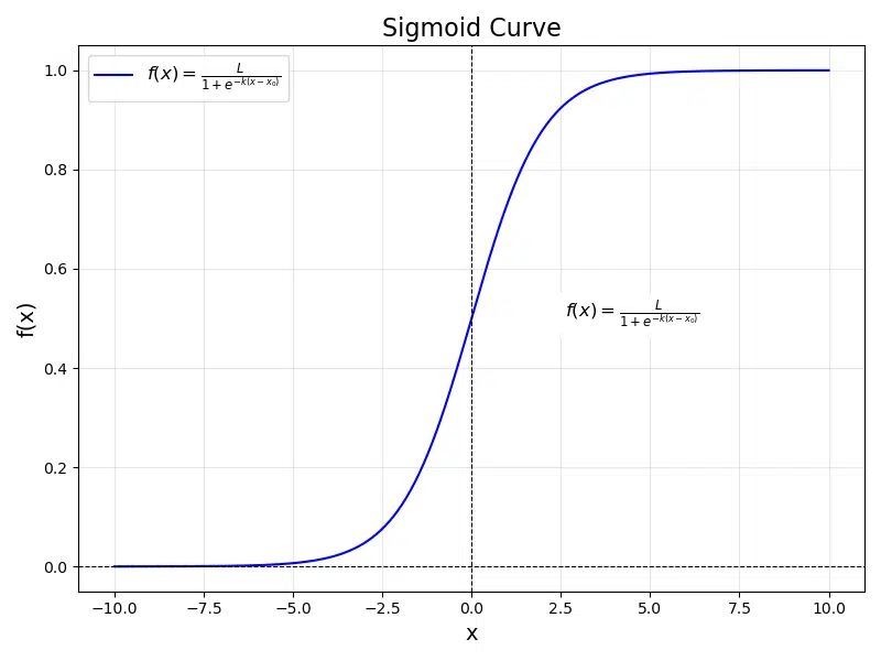
A sigmoid curve, mathematically speaking, is a function that produces an S-shaped graph. The most basic and well-known sigmoid function is the logistic function, which can be expressed as:
where:
- \( L \): Maximum value (carrying capacity)
- \( k \): Steepness of the curve
- \( x_0 \): \(x\)-value of the sigmoid’s midpoint
- \( e \): Euler’s number, the base of natural logarithms (\( \approx 2.718 \))
The curve has three distinct phases:
- Lag Phase: Initial slow growth or change (bottom of the S)
- Exponential Phase: Rapid growth or change (middle of the S)
- Plateau Phase: Leveling off to a maximum value (top of the S)

Mathematical Insight
The derivative of a sigmoid function is a bell curve, which means the rate of change is highest at the curve’s midpoint and symmetrically decreases on either side. This property makes sigmoid functions perfect for modeling processes that have natural speed limits or resource constraints.
Code Snippet: Play with the parameters \( L \), \( k \), and \( x_0 \) in this sigmoid function code to see how they influence the steepness, midpoint, and maximum value of the curve. Try different combinations to understand the curve’s behavior!
import numpy as np
import matplotlib.pyplot as plt


# Define the sigmoid function
def sigmoid(x, L=1, k=1, x0=0):
    return L / (1 + np.exp(-k * (x - x0)))


# Generate x values and compute y values for the sigmoid curve
x = np.linspace(-10, 10, 500)
y = sigmoid(x, L=1, k=1, x0=0)

# Plot the sigmoid curve
plt.figure(figsize=(8, 6))
plt.plot(x, y, label="$f(x) = \\frac{L}{1 + e^{-k(x-x_0)}}$", color="b")

# Annotate the equation on the plot
plt.text(
    4.5, 0.5,
    "$f(x) = \\frac{L}{1 + e^{-k(x-x_0)}}$",
    fontsize=12, color="black", ha="center", backgroundcolor="white"
)

# Add labels, title, and legend
plt.title("Sigmoid Curve", fontsize=16)
plt.xlabel("x", fontsize=14)
plt.ylabel("f(x)", fontsize=14)
plt.axhline(0, color="black", linewidth=0.8, linestyle="--")
plt.axvline(0, color="black", linewidth=0.8, linestyle="--")
plt.grid(alpha=0.3)
plt.legend(fontsize=12)

# Show the plot
plt.tight_layout()
plt.show()
Common Examples in Biology
1. Population Growth
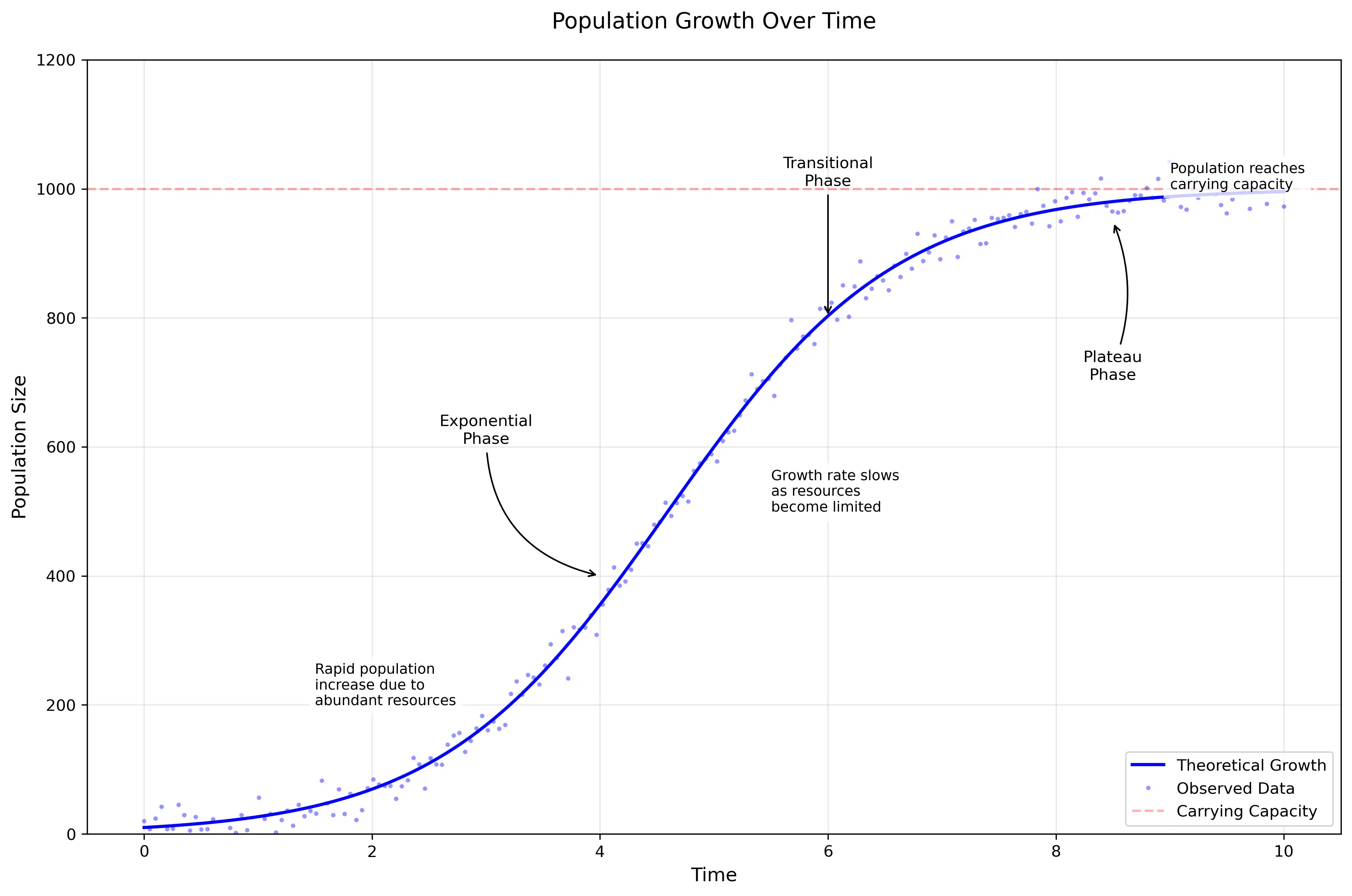
Population growth in a closed environment follows the logistic growth model, described by the differential equation:
where:
- \( N \): Population size
- \( r \): Intrinsic growth rate
- \( K \): Carrying capacity
This equation captures how populations initially grow exponentially when resources are abundant, but growth slows as they approach the environment’s carrying capacity. We see this pattern in bacterial cultures, yeast populations, and even human populations in confined areas.

Code Snippet: Modify parameters like the growth rate \( r \) and carrying capacity \( K \) to see how the population curve adapts. Test different values to explore logistic growth dynamics.
import numpy as np
import matplotlib.pyplot as plt

# Set random seed for reproducibility
np.random.seed(42)

# Create time points
t = np.linspace(0, 10, 200)

# Population growth parameters
K = 1000  # Carrying capacity
r = 1.0   # Growth rate
N0 = 10   # Initial population

# Calculate population sizes using logistic equation
N = K / (1 + ((K - N0)/N0) * np.exp(-r * t))

# Add some random noise to make it look more realistic
noise = np.random.normal(0, 20, len(t))
N_noisy = N + noise

# Create the plot
plt.figure(figsize=(12, 8))

# Plot the smooth curve
plt.plot(t, N, 'b-', linewidth=2, label='Theoretical Growth')
# Plot noisy data points
plt.plot(t, N_noisy, 'b.', alpha=0.3, markersize=4, label='Observed Data')

# Customize the plot
plt.title('Population Growth Over Time', fontsize=14, pad=20)
plt.xlabel('Time', fontsize=12)
plt.ylabel('Population Size', fontsize=12)

# Add grid
plt.grid(True, alpha=0.3)

# Define regions for different phases
lag_end = 2
exp_end = 6
plateau_start = 8

# Add phase annotations
# Exponential Phase
plt.annotate('Exponential\nPhase',
            xy=(4, 400),
            xytext=(3, 600),
            ha='center',
            va='bottom',
            fontsize=10,
            arrowprops=dict(arrowstyle='->',
                           connectionstyle='arc3,rad=0.4'))

# Transitional Phase
plt.annotate('Transitional\nPhase',
            xy=(6, 800),
            xytext=(6, 1000),
            ha='center',
            va='bottom',
            fontsize=10,
            arrowprops=dict(arrowstyle='->',
                           connectionstyle='arc3,rad=0.0'))

# Plateau Phase
plt.annotate('Plateau\nPhase',
            xy=(8.5, 950),
            xytext=(8.5, 750),
            ha='center',
            va='top',
            fontsize=10,
            arrowprops=dict(arrowstyle='->',
                           connectionstyle='arc3,rad=0.2'))

# Add characteristics text boxes
plt.text(1.5, 200,
         'Rapid population\nincrease due to\nabundant resources',
         fontsize=9,
         bbox=dict(facecolor='white', alpha=0.8, edgecolor='none'))

plt.text(5.5, 500,
         'Growth rate slows\nas resources\nbecome limited',
         fontsize=9,
         bbox=dict(facecolor='white', alpha=0.8, edgecolor='none'))

plt.text(9, 1000,
         'Population reaches\ncarrying capacity',
         fontsize=9,
         bbox=dict(facecolor='white', alpha=0.8, edgecolor='none'))

# Add carrying capacity line
plt.axhline(y=K, color='r', linestyle='--', alpha=0.3, label='Carrying Capacity')

# Customize the appearance
plt.legend(loc='lower right')
plt.ylim(0, 1200)

# Show figure
plt.tight_layout()
plt.show()
2. Enzyme Kinetics
Enzyme kinetics is a critical area in biochemistry that describes the rate of chemical reactions catalyzed by enzymes. The Michaelis-Menten equation provides a foundational model to understand how reaction rates depend on substrate concentration. However, in cases where enzymes exhibit cooperative binding, the classic Michaelis-Menten model is modified by the Hill equation to account for this behavior.
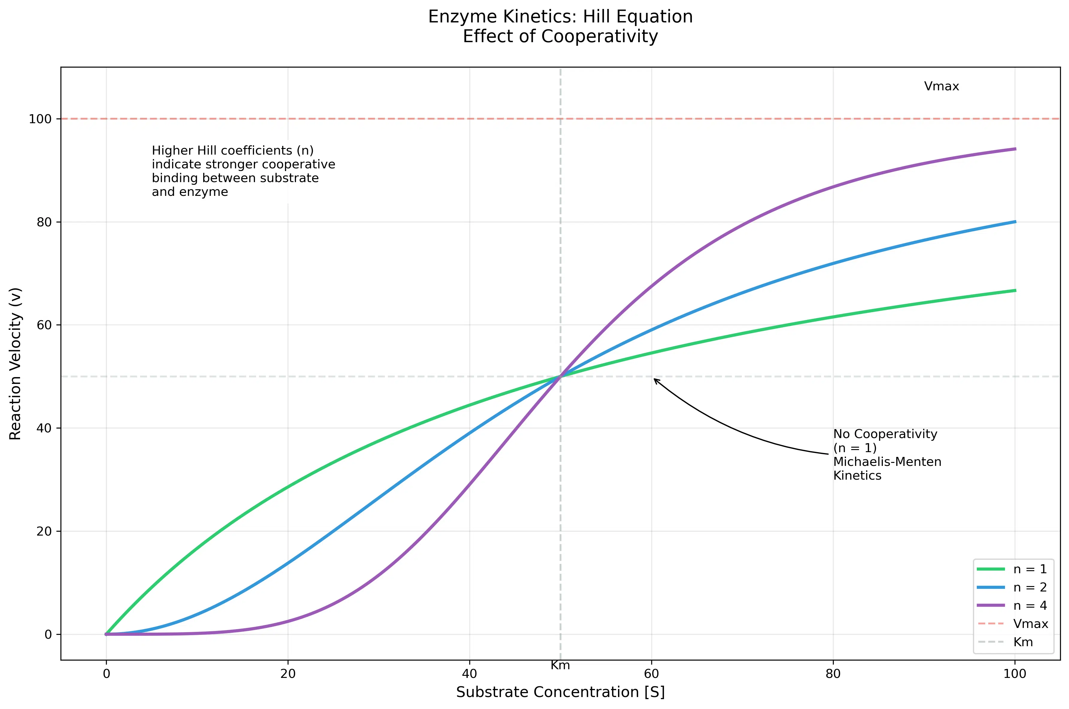
The Hill equation is particularly useful for modeling enzymes that work in a cooperative manner, where the binding of one substrate molecule affects the binding affinity of subsequent substrate molecules. This cooperative effect introduces sigmoid behavior into the reaction rate curve, making it distinct from the hyperbolic shape seen in non-cooperative systems.
where:
- \( v \): Reaction velocity
- \( V_{max} \): Maximum reaction velocity
- \( [S] \): Substrate concentration
- \( n \): Hill coefficient (cooperativity)
The Hill coefficient \( n \) is a measure of cooperativity:
- \( n = 1 \): No cooperativity, resembling the classic Michaelis-Menten behavior.
- \( n > 1 \): Positive cooperativity, where substrate binding increases the affinity for additional substrate molecules.
- \( n < 1 \): Negative cooperativity, where substrate binding decreases the affinity for subsequent molecules.
This framework helps in understanding complex enzyme behaviors in metabolic pathways, drug interactions, and other biochemical processes. By experimenting with the parameters \( V_{max} \), \( K_m \), and \( n \), you can visualize how these factors influence the reaction velocity curve.
Example Output
The following table shows reaction velocities calculated at different substrate concentrations and Hill coefficients. Observe how changes in the Hill coefficient \( n \) affect the curve’s behavior, transitioning from hyperbolic to sigmoid.
———————————————
S = 10, n = 1 | v = 16.67
S = 10, n = 2 | v = 3.85
S = 10, n = 4 | v = 0.16
S = 25, n = 1 | v = 33.33
S = 25, n = 2 | v = 20.00
S = 25, n = 4 | v = 5.88
S = 50, n = 1 | v = 50.00
S = 50, n = 2 | v = 50.00
S = 50, n = 4 | v = 50.00
S = 75, n = 1 | v = 60.00
S = 75, n = 2 | v = 69.23
S = 75, n = 4 | v = 83.51
S = 100, n = 1 | v = 66.67
S = 100, n = 2 | v = 80.00
S = 100, n = 4 | v = 94.12
This output demonstrates the dependence of reaction velocity on substrate concentration and Hill coefficient. For low \( n \), the curve resembles Michaelis-Menten behavior, whereas higher \( n \) values introduce sigmoid characteristics, indicating cooperative binding.

Code Snippet: Experiment with the parameters \( V_{max} \), \( K_m \), and substrate concentration \( [S] \) in this enzyme kinetics code. See how changes in these values affect the reaction velocity curve and understand the dynamics of enzyme-substrate interactions!
import numpy as np
import matplotlib.pyplot as plt

def hill_equation(S, Vmax, Km, n):
    """
    Calculate reaction velocity using the Hill equation

    Parameters:
    S (array): Substrate concentrations
    Vmax (float): Maximum reaction velocity
    Km (float): Substrate concentration at half-maximum velocity
    n (float): Hill coefficient (cooperativity)

    Returns:
    array: Reaction velocities
    """
    return Vmax * (S**n) / (Km**n + S**n)

# Create substrate concentration range
S = np.linspace(0, 100, 200)

# Parameters
Vmax = 100  # Maximum velocity
Km = 50    # Michaelis constant
hill_coefficients = [1, 2, 4]  # Different cooperativity values

# Create the plot
plt.figure(figsize=(12, 8))

# Plot for each Hill coefficient
colors = ['#2ecc71', '#3498db', '#9b59b6']  # Different colors for each curve
for n, color in zip(hill_coefficients, colors):
    v = hill_equation(S, Vmax, Km, n)
    plt.plot(S, v, label=f'n = {n}', color=color, linewidth=2.5)

# Add horizontal line for Vmax
plt.axhline(y=Vmax, color='#e74c3c', linestyle='--', alpha=0.5,
           label='Vmax')

# Add vertical line for Km
plt.axvline(x=Km, color='#95a5a6', linestyle='--', alpha=0.5,
           label='Km')

# Add Vmax/2 marker
plt.axhline(y=Vmax/2, color='#95a5a6', linestyle='--', alpha=0.3)

# Customize the plot
plt.title('Enzyme Kinetics: Hill Equation\nEffect of Cooperativity',
          fontsize=14, pad=20)
plt.xlabel('Substrate Concentration [S]', fontsize=12)
plt.ylabel('Reaction Velocity (v)', fontsize=12)
plt.grid(True, alpha=0.3)

plt.annotate('No Cooperativity\n(n = 1)\nMichaelis-Menten\nKinetics',
            xy=(60, 50),
            xytext=(80, 30),
            fontsize=10,
            arrowprops=dict(arrowstyle='->',
                           connectionstyle='arc3,rad=-0.2'))

# Add text box explaining cooperativity
plt.text(5, 85,
         'Higher Hill coefficients (n)\nindicate stronger cooperative\nbinding between substrate\nand enzyme',
         fontsize=10,
         bbox=dict(facecolor='white', alpha=0.8, edgecolor='none'))

# Add Km and Vmax annotations
plt.annotate('Vmax',
            xy=(90, Vmax),
            xytext=(90, Vmax+5),
            fontsize=10,
            ha='left',
            va='bottom')

plt.annotate('Km',
            xy=(Km, 0),
            xytext=(Km, -5),
            fontsize=10,
            ha='center',
            va='top')

# Customize legend
plt.legend(loc='lower right', fontsize=10)

# Set axis ranges
plt.xlim(-5, 105)
plt.ylim(-5, 110)

# Show figure
plt.tight_layout()
plt.show()

# Calculate and print some key values for verification
print("\nKey Values at different substrate concentrations:")
test_S = [10, 25, 50, 75, 100]
print("\nSubstrate concentration | Reaction Velocity (v)")
print("-" * 45)
for S_val in test_S:
    for n in hill_coefficients:
        v = hill_equation(np.array([S_val]), Vmax, Km, n)[0]
        print(f"S = {S_val:3d}, n = {n} | v = {v:.2f}")
3. Oxygen-Hemoglobin Binding
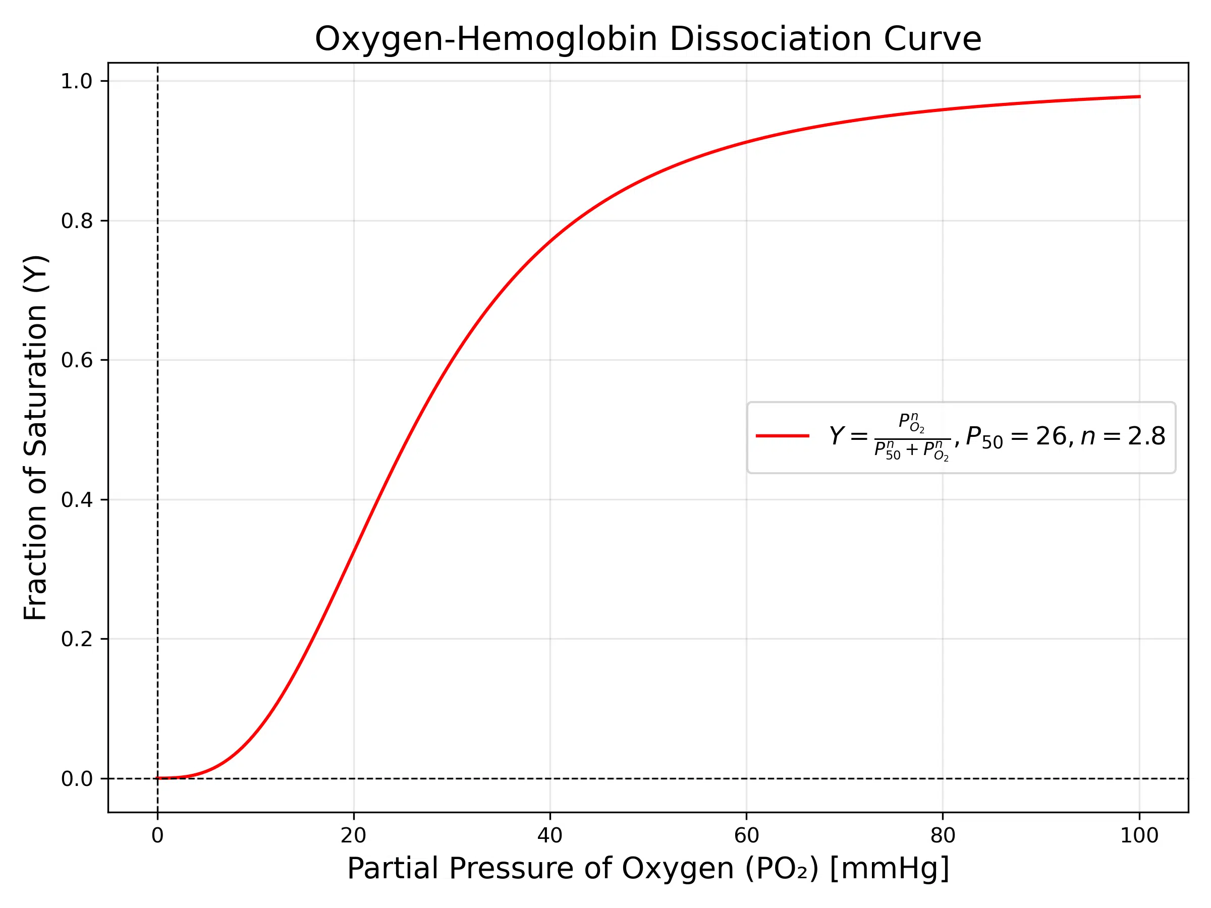
The oxygen-hemoglobin dissociation curve is a classic example of cooperative binding, described by the Hill equation:
where:
- \( Y \): Fraction of hemoglobin binding sites occupied
- \( P_{O_2} \): Partial pressure of oxygen
- \( P_{50} \): Partial pressure of oxygen at 50% saturation
- \( n \): Hill coefficient, indicating the degree of cooperativity
This curve demonstrates the cooperative nature of oxygen binding to hemoglobin. At low oxygen pressures, the binding sites are less saturated, reflecting the difficulty in oxygen binding. As oxygen pressure increases, binding becomes easier due to cooperative effects, which is reflected in the steep middle section of the curve. At higher pressures, saturation approaches its maximum as all binding sites are occupied.
This behavior is critical for oxygen transport in mammals. Hemoglobin’s ability to pick up oxygen in the lungs (high oxygen pressure) and release it in tissues (low oxygen pressure) is governed by this curve.

The Hill coefficient (n) quantifies the cooperativity: when n > 1, cooperative binding occurs, as seen in hemoglobin. This property allows hemoglobin to effectively transport oxygen from the lungs to tissues while responding dynamically to changes in oxygen demand.
Code Snippet: Experiment with the Hill coefficient \( n \), partial pressure \( P_{O_2} \), and \( P_{50} \) values in this code. Observe how these parameters affect the cooperative binding curve and saturation levels!
import numpy as np
import matplotlib.pyplot as plt


# Define the Hill equation function
def hill_equation(pO2, P50, n):
    return (pO2 ** n) / (P50 ** n + pO2 ** n)


# Generate data for the plot
pO2 = np.linspace(0, 100, 500)  # Partial pressure of oxygen
P50 = 26  # PO₂ at 50% saturation (typical for hemoglobin)
n = 2.8  # Hill coefficient (indicating cooperativity)

# Calculate Y values using the Hill equation
Y = hill_equation(pO2, P50, n)

# Plot the oxygen-hemoglobin dissociation curve
plt.figure(figsize=(8, 6))
plt.plot(pO2, Y, label=f"$Y = \\frac{{P_{{O_2}}^n}}{{P_{{50}}^n + P_{{O_2}}^n}}, P_{{50}}={P50}, n={n}$", color="r")

# Add labels, title, and legend
plt.title("Oxygen-Hemoglobin Dissociation Curve", fontsize=16)
plt.xlabel("Partial Pressure of Oxygen (PO₂) [mmHg]", fontsize=14)
plt.ylabel("Fraction of Saturation (Y)", fontsize=14)
plt.axhline(0, color="black", linewidth=0.8, linestyle="--")
plt.axvline(0, color="black", linewidth=0.8, linestyle="--")
plt.grid(alpha=0.3)
plt.legend(fontsize=12)

# Show figure
plt.tight_layout()
plt.show()
Why Does Nature Prefer Sigmoid Curves?
💡Key Insight: Sigmoid curves represent a perfect balance between efficiency and control in biological systems, combining rapid response with stable endpoints.
1. Resource Limitations
Most biological systems operate within finite resources. The sigmoid curve naturally accounts for this by showing:
• Rapid growth when optimal conditions are met
• Gradual slowdown as resources become scarce
2. Feedback Mechanisms
Biological systems often involve complex feedback loops that create self-regulating behaviour. Sigmoid curves emerge naturally from:
• Negative feedback limiting growth as the system approaches capacity
• Multiple feedback loops working in concert to maintain homeostasis
3. Stability and Control
Sigmoid responses provide biological systems with controlled reactions to changes because:
• The steep middle section allows for rapid response when needed
• The plateau ensures stability by preventing runaway reactions
Practical Applications
Understanding sigmoid patterns helps us in multiple fields:
Medical Applications
- Drug dose-response relationships follow sigmoid curves, helping determine optimal dosing
- Understanding hormone responses aids in endocrine disorder treatments
- Modeling disease spread helps in epidemic management
Biotechnology
- Optimizing fermentation processes in industrial microbiology
- Designing bioreactors for maximum efficiency
- Developing new enzyme-based industrial processes
Environmental Science
- Predicting species population dynamics
- Understanding ecosystem responses to environmental changes
- Modeling climate change impacts on biological systems
Sigmoid Functions in Machine Learning
For a detailed introduction to sigmoid functions, visit our blog post: An Introduction to the Sigmoid Function.
The prevalence of sigmoid functions in biological systems has inspired their widespread use in artificial neural networks and machine learning. Just as nature has optimized these curves for biological processes, we’ve found them equally valuable in artificial intelligence.
💡Key Connection: The similarities between biological neurons and artificial neural networks are not coincidental – both use sigmoid-like activation functions to process information and make decisions.
Common Applications in Neural Networks
The standard logistic function used in neural networks, where:
- \( \sigma(x) \): Sigmoid function output
- \( x \): Input value
- \( e \): Euler’s number, the base of natural logarithms (\( \approx 2.718 \))
This function shares remarkable similarities with biological processes:
| Biological System | Neural Network Equivalent |
|---|---|
| Neuron firing threshold | Activation threshold |
| Hormone response curves | Output normalization |
| Cooperative binding | Feature interaction learning |
Key Properties for Machine Learning
- Bounded Output: The sigmoid function maps input values to a range between 0 and 1, making it ideal for probabilistic interpretations, such as binary classification.
- Smooth Gradient: Its continuous and differentiable nature ensures smooth gradient computations, enabling efficient learning through gradient descent.
- Non-linear Activation: The sigmoid introduces non-linearity, allowing neural networks to model complex patterns and decision boundaries.
Challenges of Using Sigmoid Functions
- Vanishing Gradients: At extreme input values, the gradient of the sigmoid function becomes very small, slowing down the learning process in deep networks.
- Output Saturation: Saturation at 0 or 1 can make weight updates inefficient during training.
Evolution of Activation Functions
While the classic sigmoid function was inspired by biological neurons, modern deep learning has evolved to use activation functions that address its limitations, such as:
- ReLU (Rectified Linear Unit): Avoids vanishing gradients by allowing unbounded positive outputs and setting negative inputs to zero.
- Leaky ReLU: A variant of ReLU that allows small gradients for negative inputs to mitigate the “dying neuron” problem.
- Tanh (hyperbolic tangent): Similar to sigmoid but outputs values between -1 and 1, centering the data and often leading to faster convergence.
These alternatives maintain some properties of biological activation while optimizing for computational efficiency and scalability in modern architectures.
Modern Usage Note
While newer activation functions have become popular in deep layers of neural networks, the sigmoid function remains crucial for tasks such as binary classification, logistic regression, and gates in LSTM networks. Its simplicity and biological analogy continue to make it a fundamental choice in many machine learning applications.
Conclusion
The prevalence of sigmoid curves in biology isn’t just a mathematical curiosity—it’s a reflection of how natural systems optimize growth, maintain stability, and manage resources. Understanding these patterns helps us better predict and work with biological systems, from developing new medicines to managing ecosystems.
As we continue to uncover new biological processes, the sigmoid curve remains a fundamental pattern that helps us understand and model the natural world. Whether you’re a student, researcher, or simply curious about biology, recognizing these patterns can provide valuable insights into how life works at all scales.
Further Reading
-
Cooperative Binding and Allosteric Regulation in Biological Systems
Monod, J., Wyman, J., & Changeux, J. P. (1965). Journal of Molecular Biology, 12(1), 88-118.
-
A generalised sigmoid population growth model with energy dependence: application to quantify the tipping point for Antarctic shallow seabed algae
Elise Mills, Graeme F. Clark, Matthew J. Simpson, Mark Baird, Matthew P. Adams
-
Mathematical Modeling of Enzyme Kinetics
Michaelis, L., & Menten, M. L. (1913). Die kinetik der invertinwirkung. Biochemische Zeitschrift, 49, 333-369.
-
An Introduction to Systems Biology
Alon, U. (2006). An Introduction to Systems Biology: Design Principles of Biological Circuits. Chapman and Hall/CRC.
-
The generalized sigmoid activation function: Competitive supervised learning
Sridhar Narayan (1997). A thorough exploration of the generalized sigmoid as an activation function for neurons in the output layer of an Multilayer perceptron network.
Attribution and Citation
If you found this guide and tools helpful, feel free to link back to this page or cite it in your work!
Suf is a senior advisor in data science with deep expertise in Natural Language Processing, Complex Networks, and Anomaly Detection. Formerly a postdoctoral research fellow, he applied advanced physics techniques to tackle real-world, data-heavy industry challenges. Before that, he was a particle physicist at the ATLAS Experiment of the Large Hadron Collider. Now, he’s focused on bringing more fun and curiosity to the world of science and research online.

